CVS Health is the world's largest healthcare provider and operates the second largest pharmacy chain in the world with approximately 9,395 stores and 94 million plan members. The primary pharmacy system in use today, RxConnect, accounts for over 25% of CVS Health’s revenue but it was built in 2007 making for an outdated and clunky experience.
1 Design Director, 1 Associate Designer, 5 Product Designers, 1 Motion Designer, 1 Creative Technologist, and 1 Project Manager.
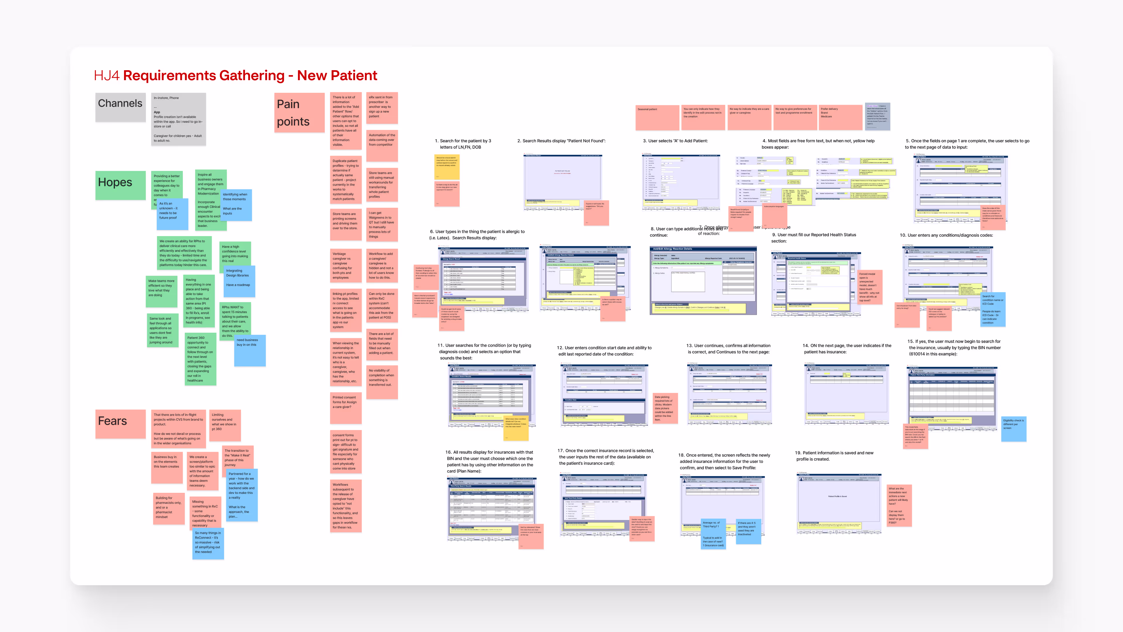
I acted as a Product Designer for the entire project, working closely with leadership to discuss the larger strategy and approach. I was solely responsible for mapping out existing workflows and designs for the following hero journey workflows: patient profile, new patient, production, production verification, counselling, patient outreach, return to stock (mobile), help, and patient outreach dashboard. The team collaborated on the use case library, pain points and opportunities library, audits, service journeys, concepts, design language, and product model.
Legacy systems are outdated, fragmented, but deeply entrenched
CVS Health has evolved as a business since the original platform was developed, along with the healthcare landscape and subsequent customer expectations. Today the focus is primarily on filling prescriptions as quickly as possible through RxConnect (RxC) which is clunky, slow, and difficult to learn. Supporting systems such as StoreOS, Command Centre, and Patient Care Central (PCC) sit separately to RxC creating a fragmented pharmacy ecosystem.
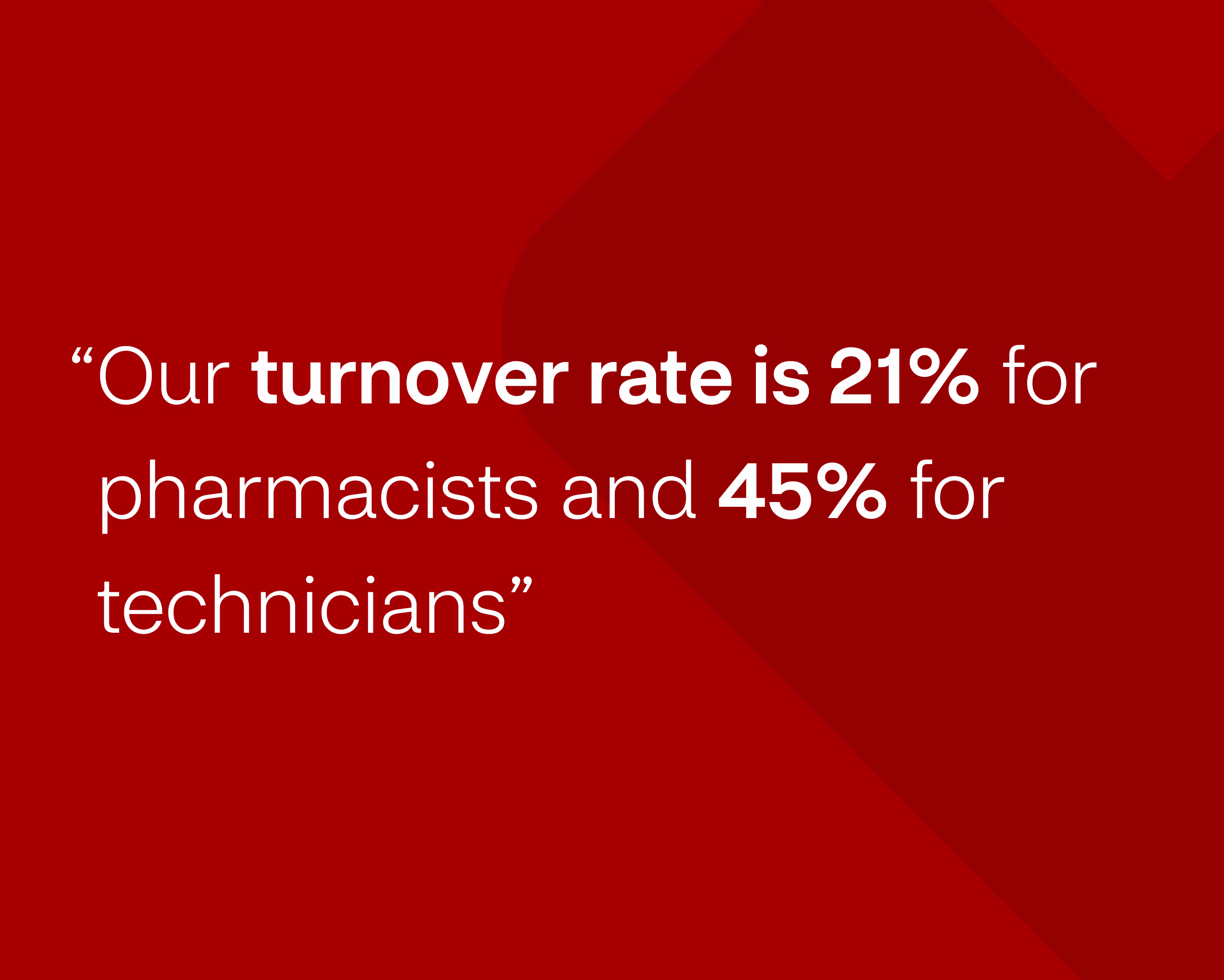
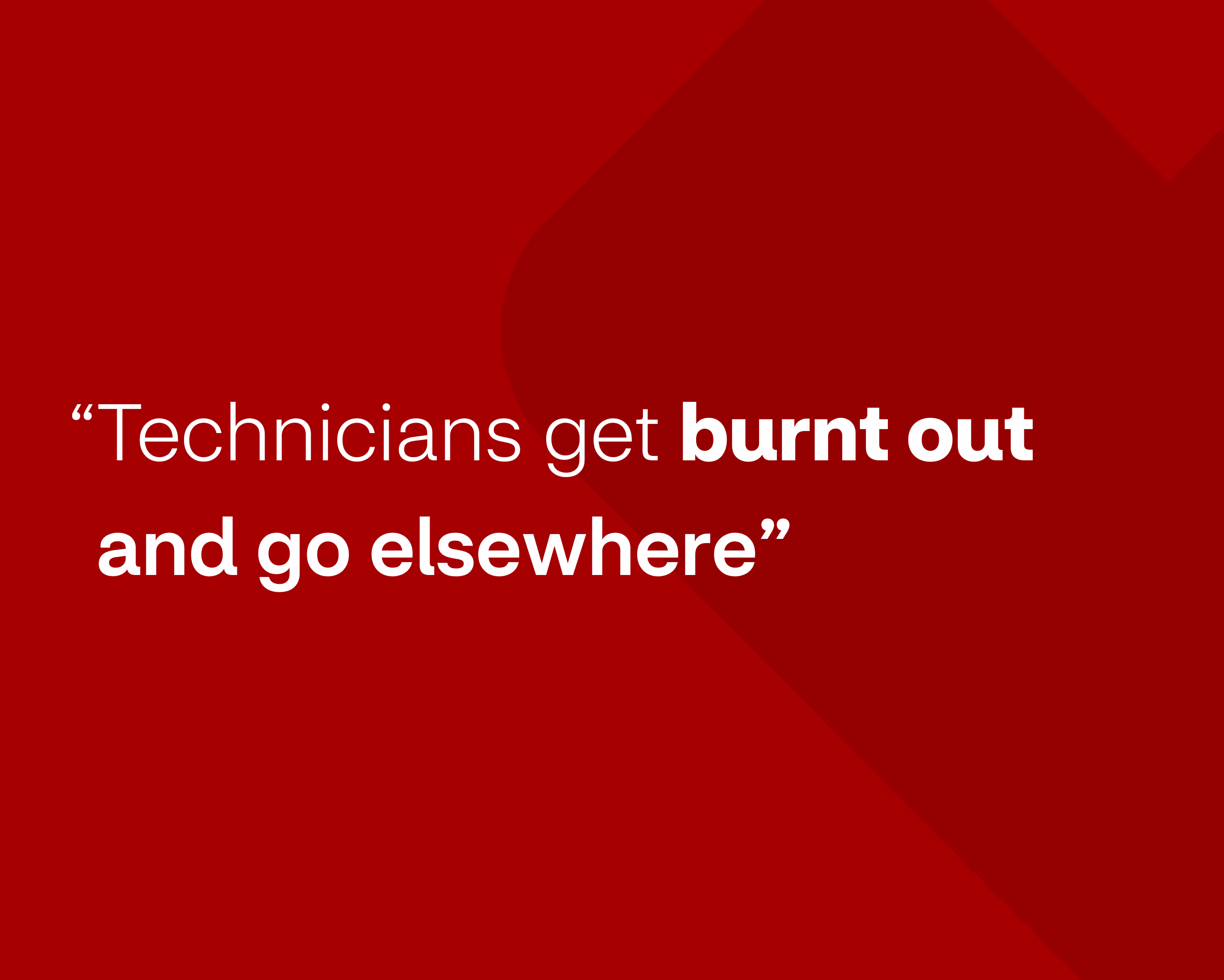
Employee turnover was extremely high due to these frustrations and business goals added an additional layer of pressure to an already stressful job. Ultimately, colleagues were unable to focus on why they originally got into healthcare – helping patients.
Optimise day-to-day workflows – providing colleagues more time to offer the best in patient care
To provide colleagues with more time to focus on patients we needed to find ways of increasing efficiency in their existing workflow. This would allow colleagues to spend more time doing what they enjoyed – helping patients! Achieving this and reducing their day-to-day frustrations would help improve staff retention rates. Everybody wins - patients, colleagues, and the business.
We broke our overall goal down into three smaller goals each with their own KPIs as a means of measuring the success of the solution.
KPIs
KPIs
KPIs
“It can’t all just be about filling prescriptions!”
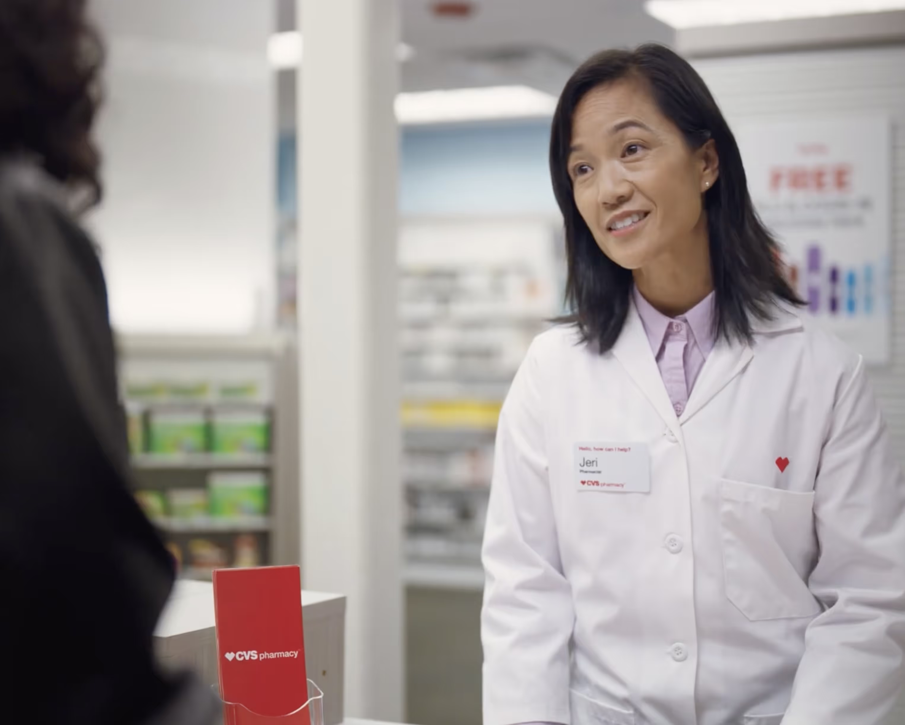
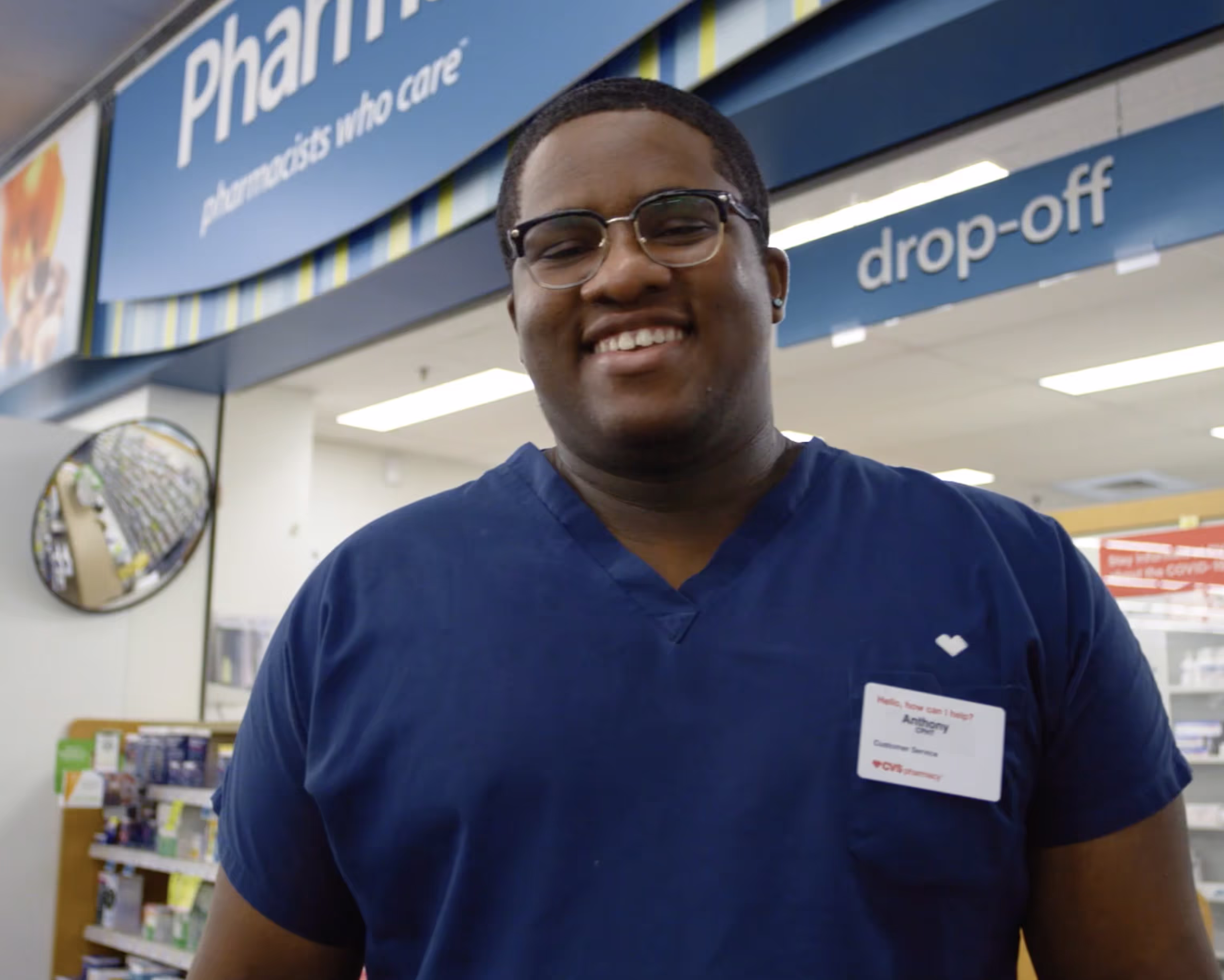
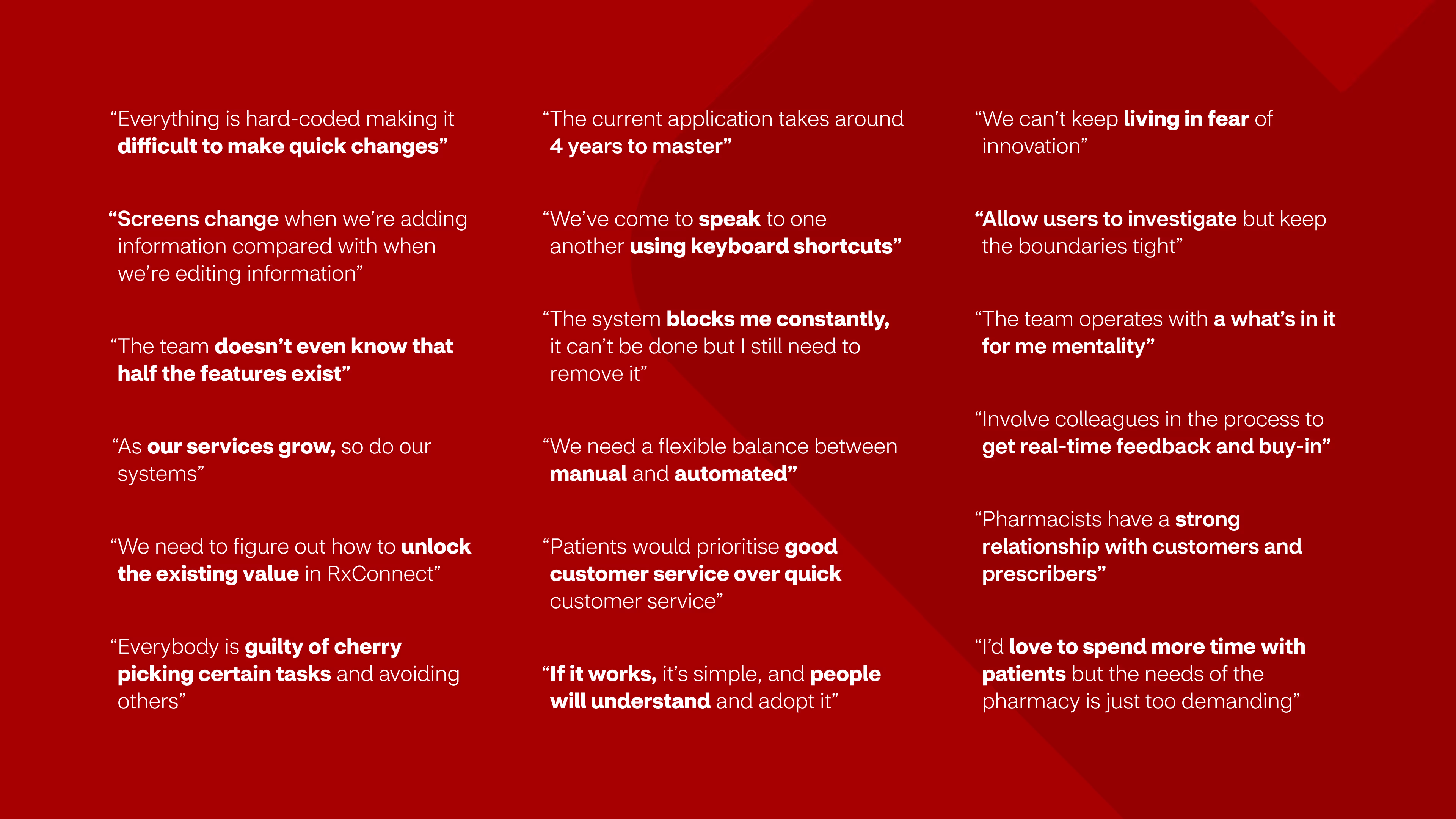
Our key stakeholders were also practising pharmacists and technicians themselves. We capitalised on this by conducting workshops and interviews with them to get their perspectives.
Pharmacists expressed that the reality of working in a pharmacy didn’t align with what motivated them to enter healthcare in the first place – helping patients. Technicians expressed their day-to-day frustrations with pharmacy systems, adding to an already stressful job. All agreed that the focus was about filling prescriptions as quickly as possible, but the systems in place worked against them. They were overly complex, slow, and cumbersome, with it taking years for colleagues to become proficient in them. Thereby, leaving colleagues with very little time to help patients.

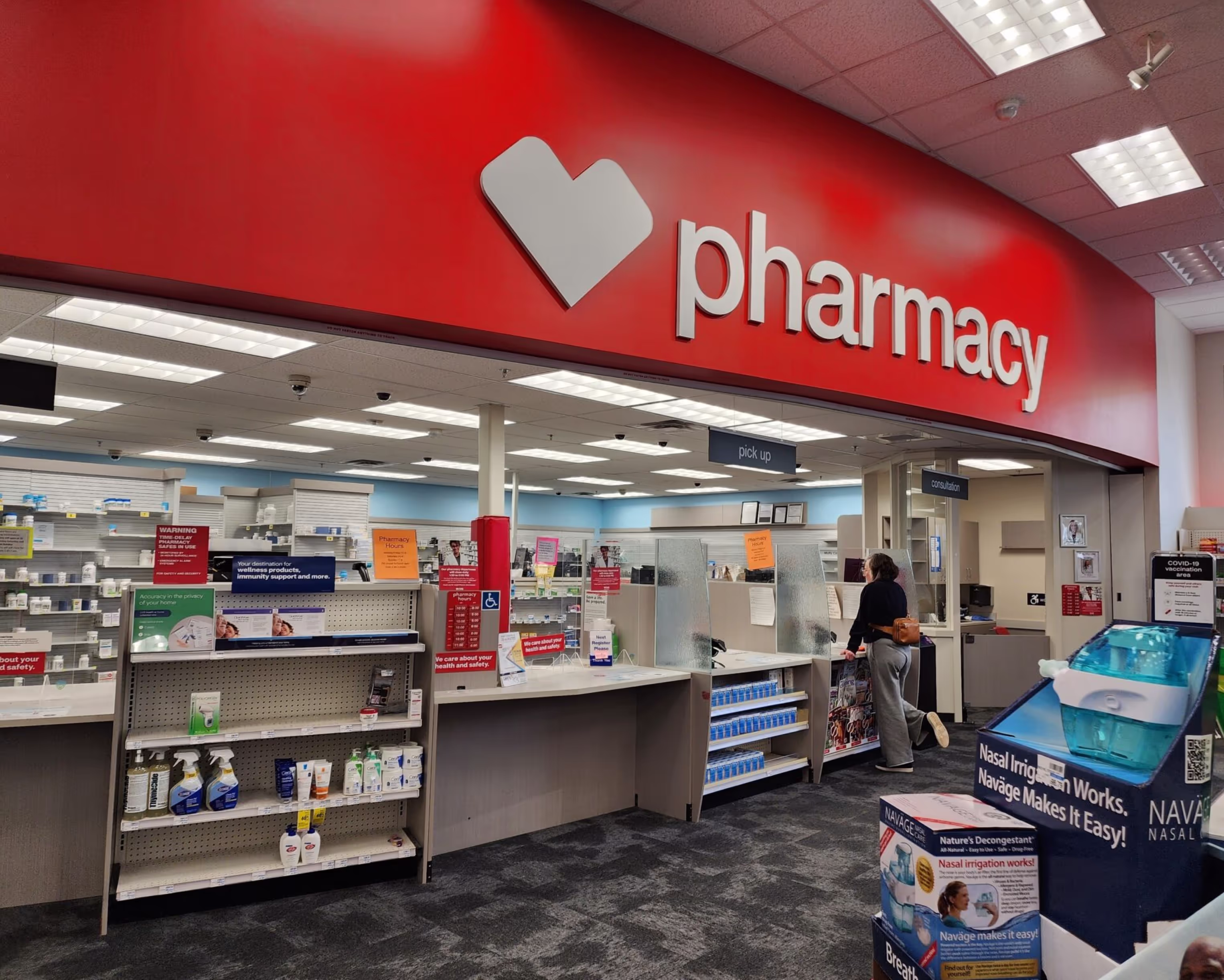
Overwhelming, unresponsive, and cumbersome
We also conducted system deep dives and audits allowing us to map out existing workflows. Whilst each system had specific strengths, they all suffered from significant usability issues.
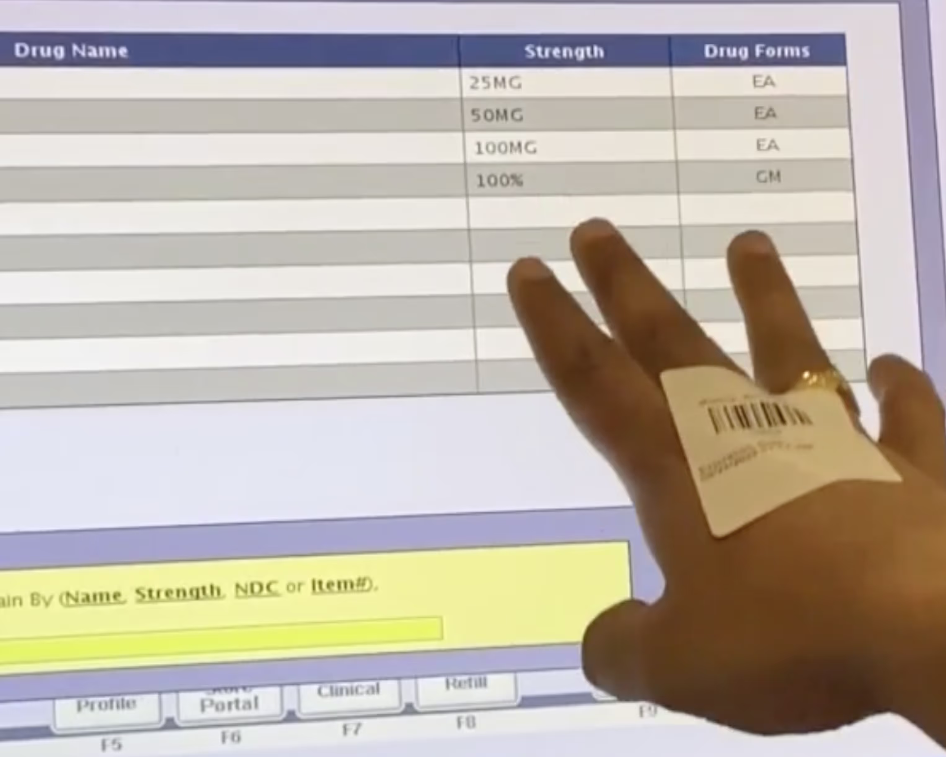
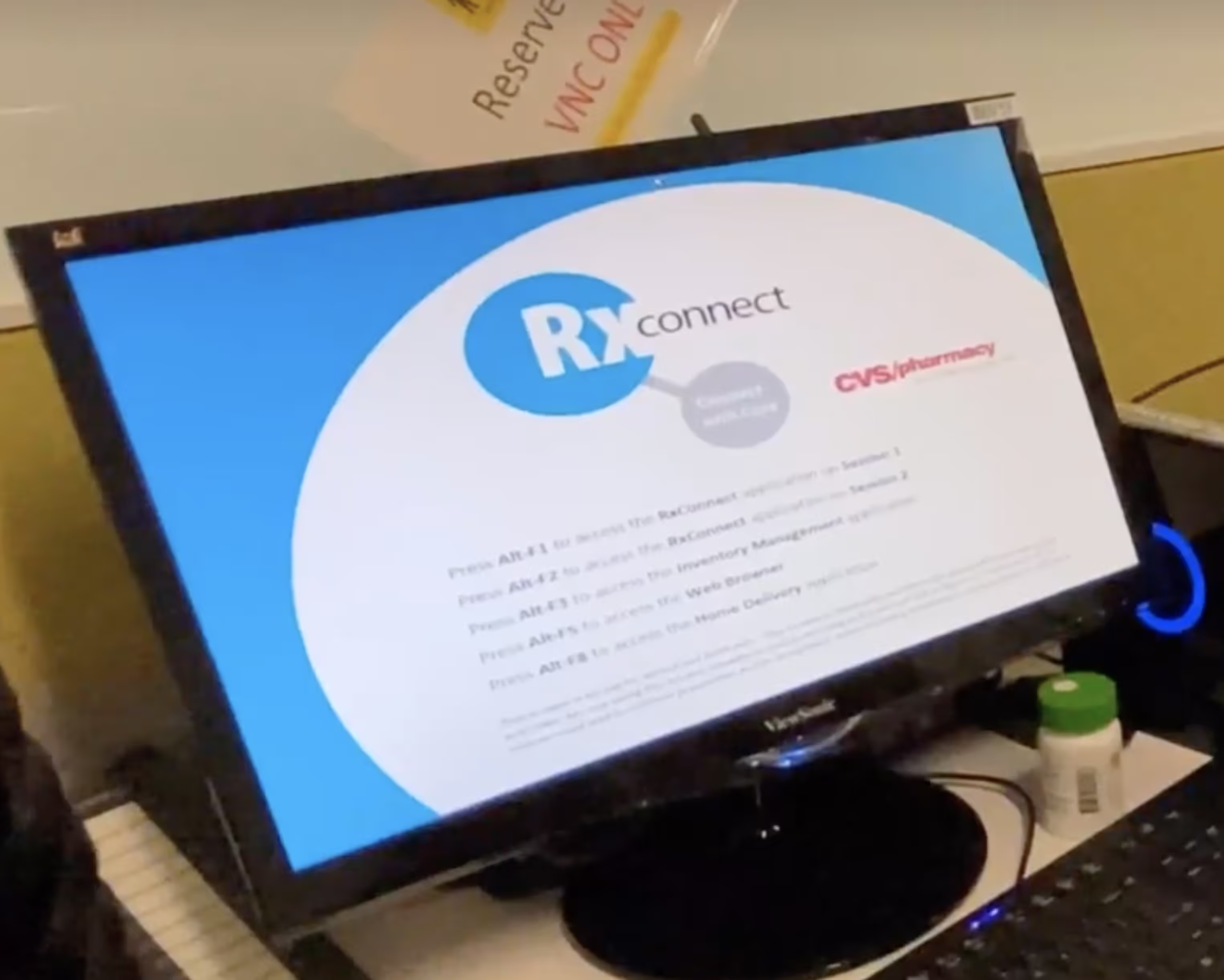
RxC had a comprehensive feature set but most features weren’t used. Instead the number of features was overwhelming to users. It only supported keyboard inputs, forcing users to memorise functions to use it efficiently. Layouts differed from screen to screen with hierarchy and scannability issues rife.
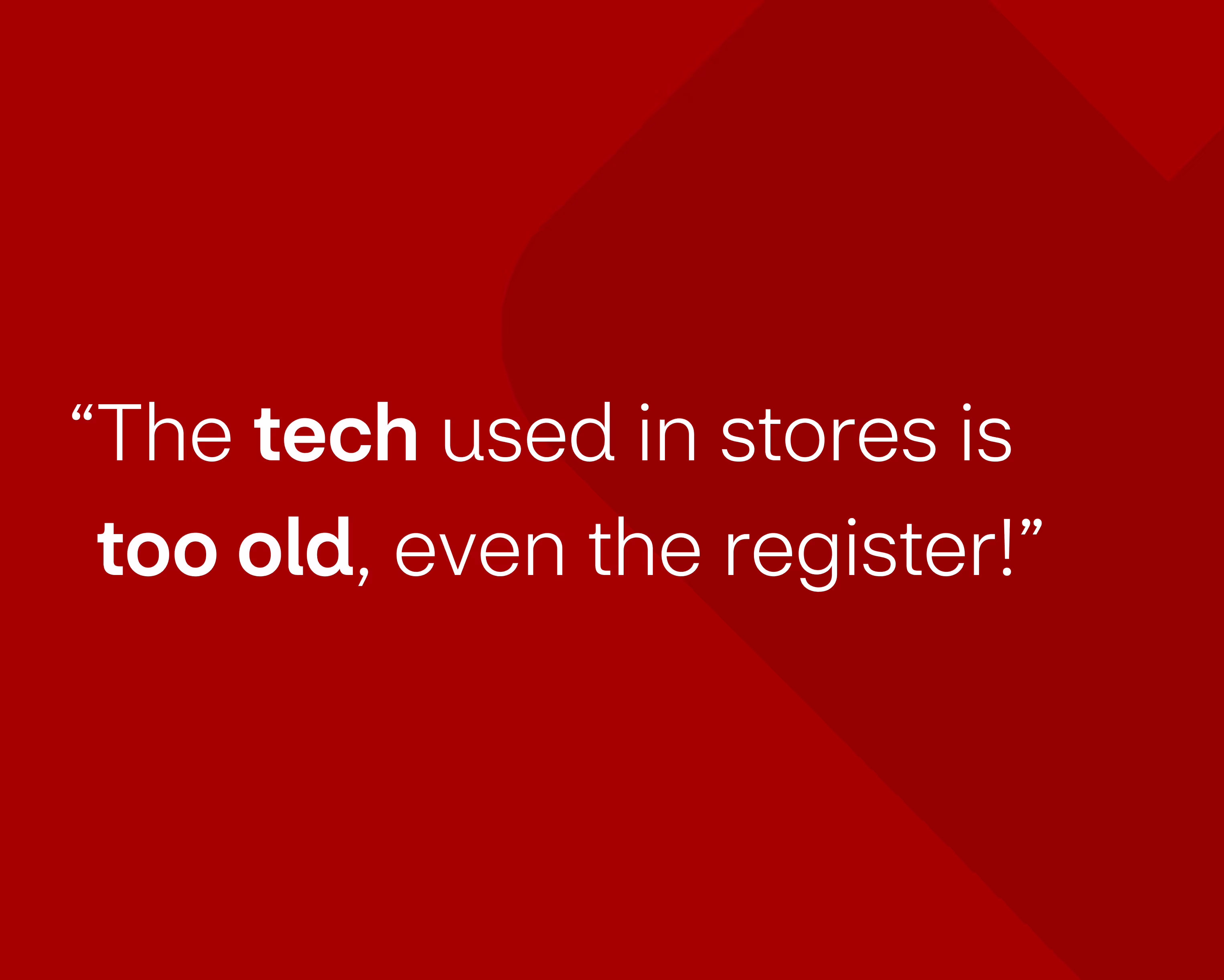
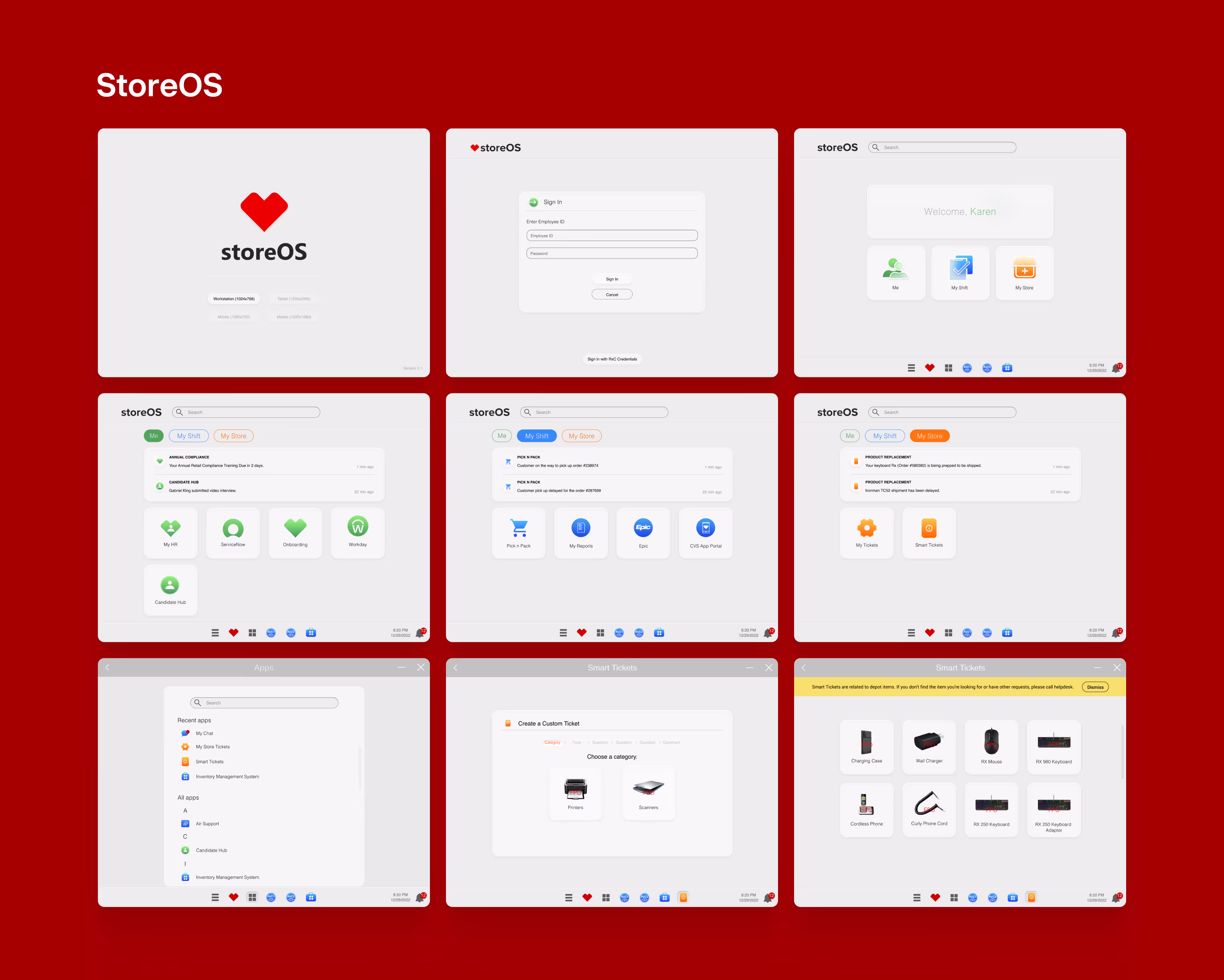
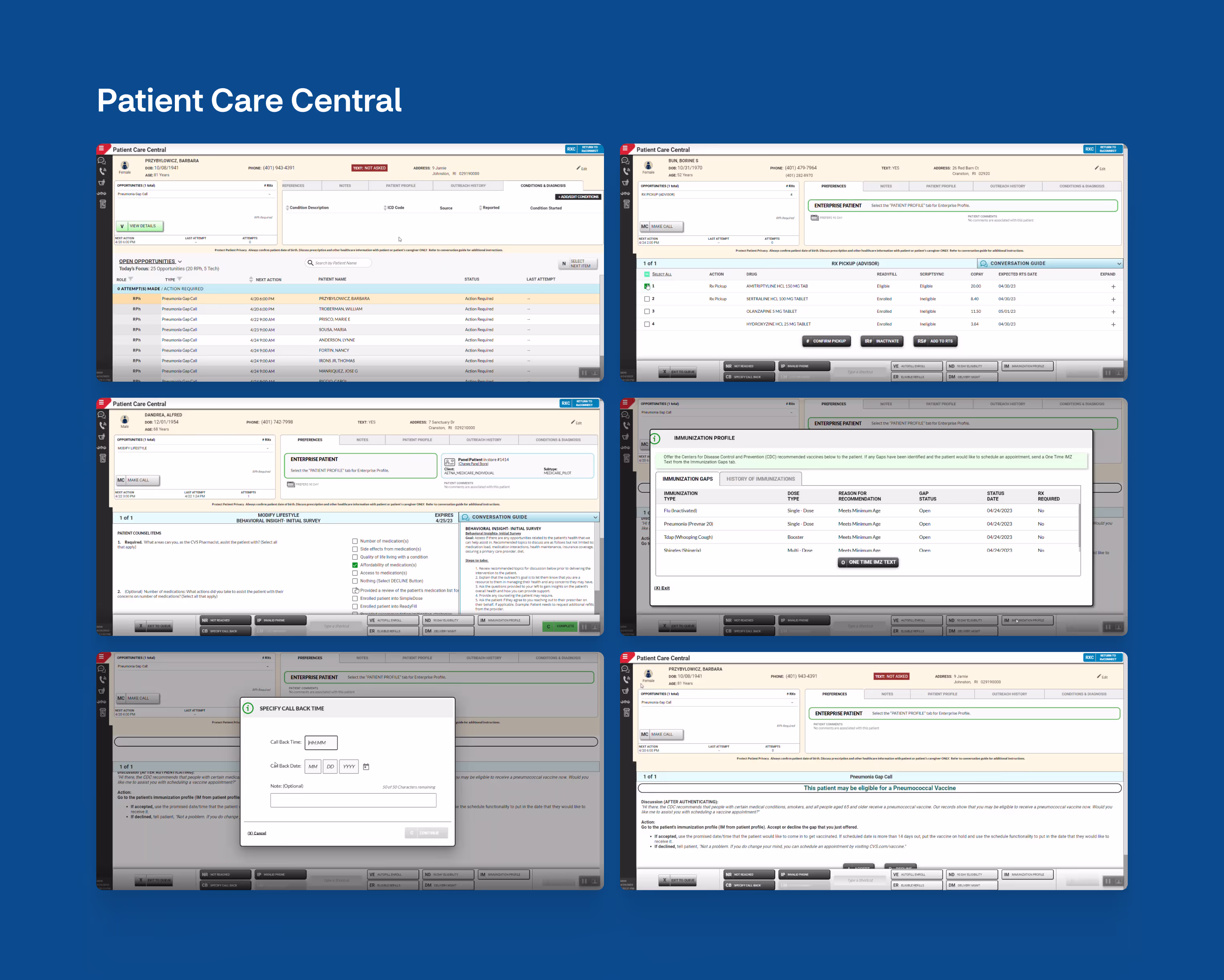
Other systems, whilst more modern, had their own problems. StoreOS acted more as a barrier than an enabler, forcing users to go through it to access different systems. Command Center had extremely limited functionality, acting more as a dashboard, but a dashboard that was rarely seen by users due to it being awkward to access. PCC was also difficult to access and instructions for patient calls were verbose and unclear.
Looking at the systems holistically surfaced further issues: patient information was siloed, users had to remember multiple log-ins, and there were significant delays when jumping from system to system.

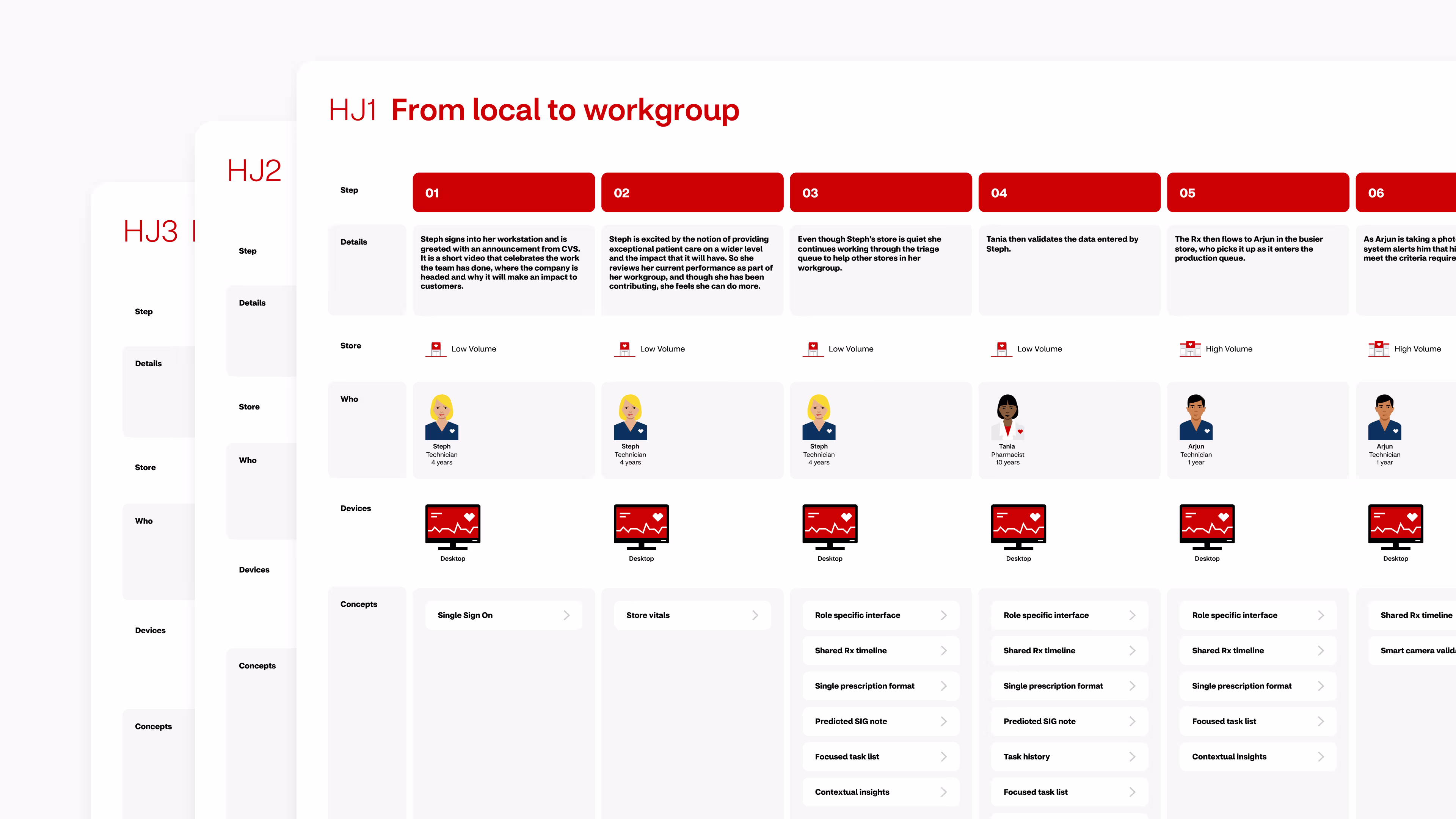
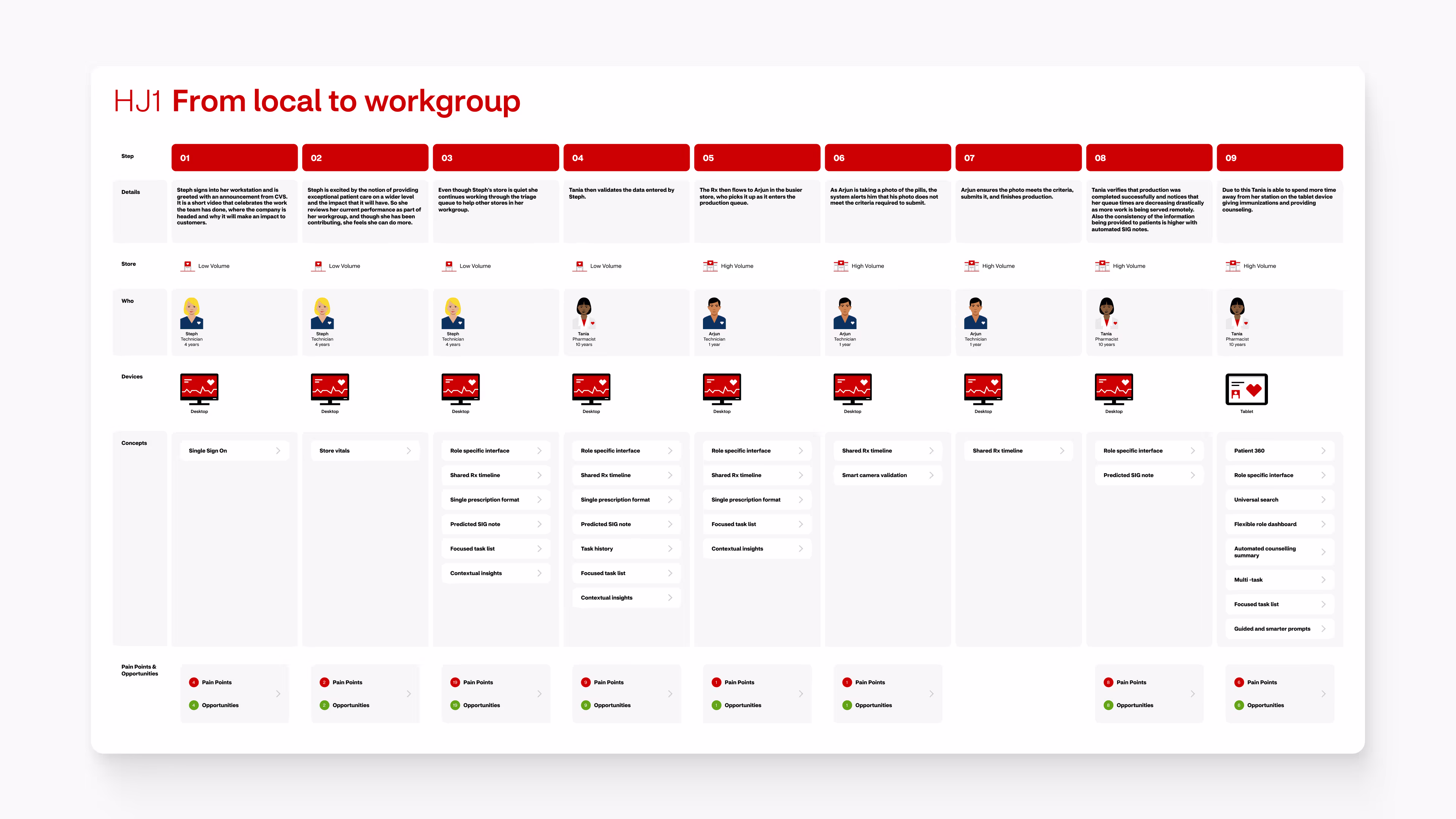
Mapping a colleagues day-to-day experience
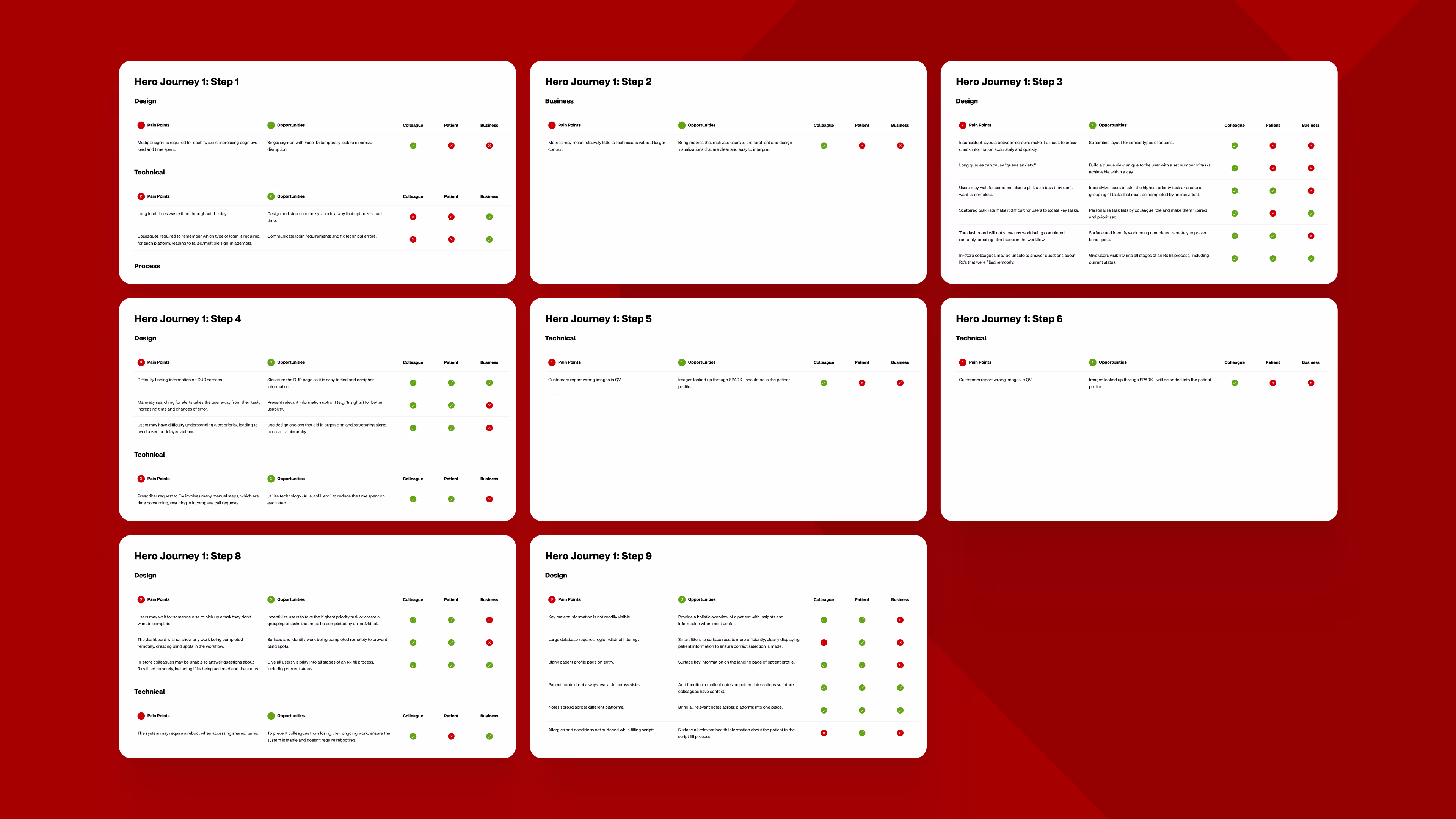
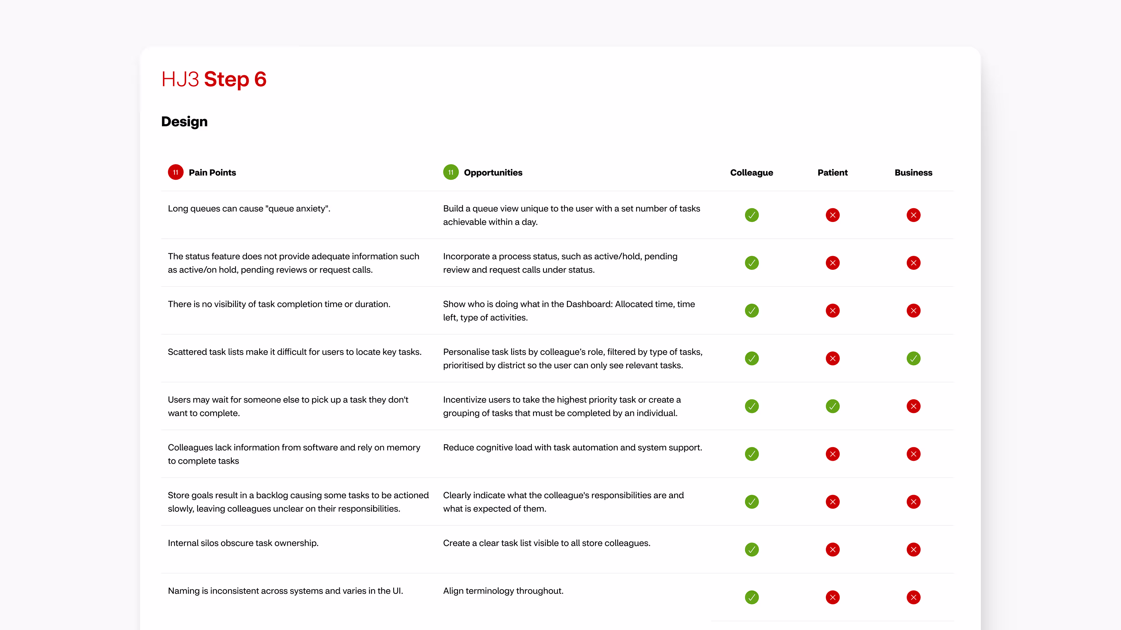
By the end of the discovery phase we had identified over 200 pain points and opportunities and over 350 use cases. Our key findings were consolidated into a service journey with pain points, opportunities, and concepts mapped to each step.
Aligning ourselves with colleagues
Based on everything we had learned so far we set our guiding principles. These aligned our design lens with the needs, values, and expectations of colleagues, and allowed to refine our ethos and central design approach into three core tenets:
Ideas for innovation
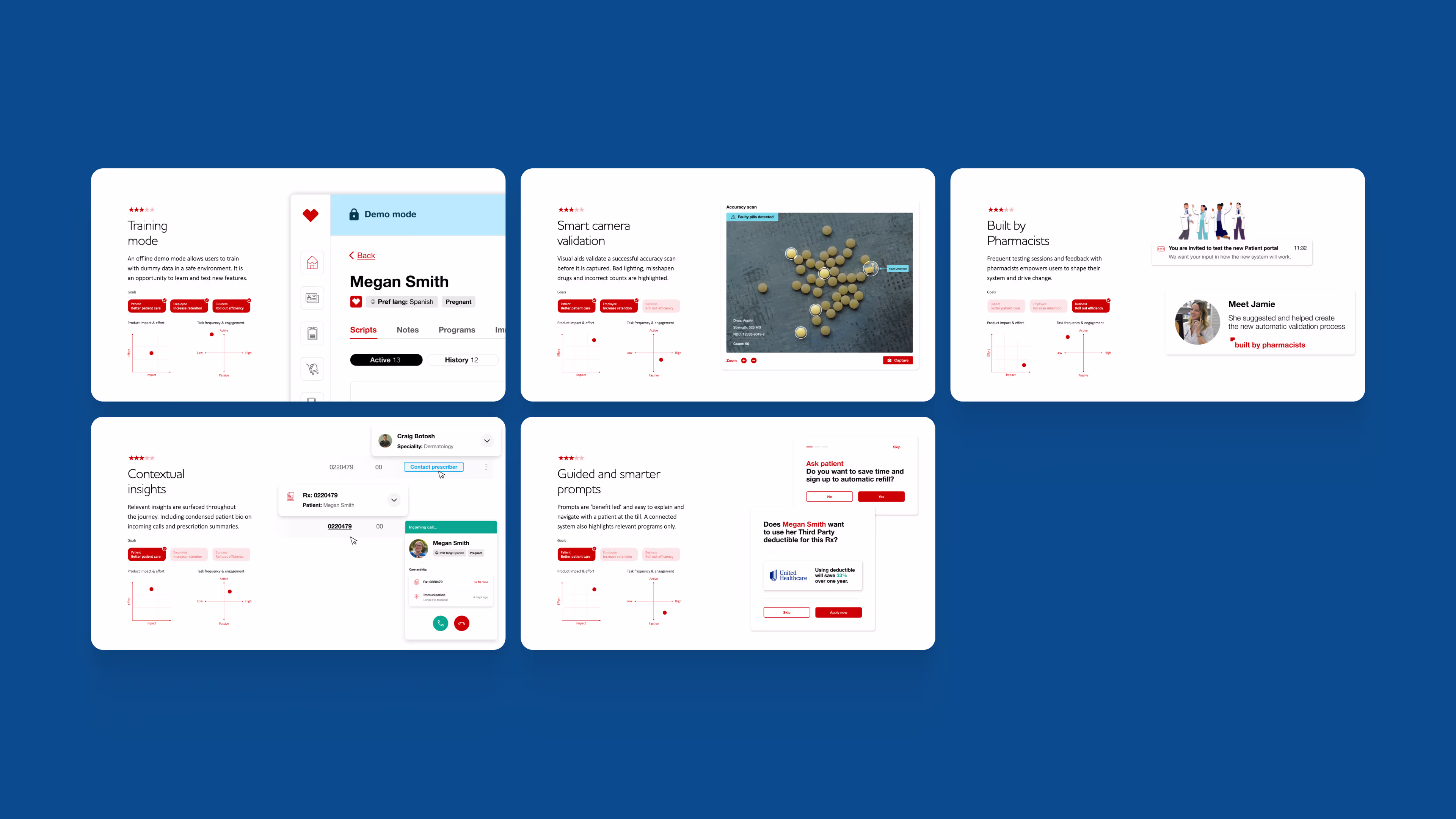
With our design principles in mind, the identified pain points were used as a springboard to brainstorm solutions. For each pain point we considered ways to resolve it – opportunities. Where strengths were found we came up with ways to enhance them further. This led to the creation of over 32 new concepts and features to optimise and enhance the existing workflow.
Each concept was compared against our project goals and prioritised using a matrix considering potential impact vs implementation effort and frequency of use vs engagement required. With our opinion formulated we conducted a workshop with our key stakeholders and used the MOSCOW system to hear their opinion and find mutual ground.

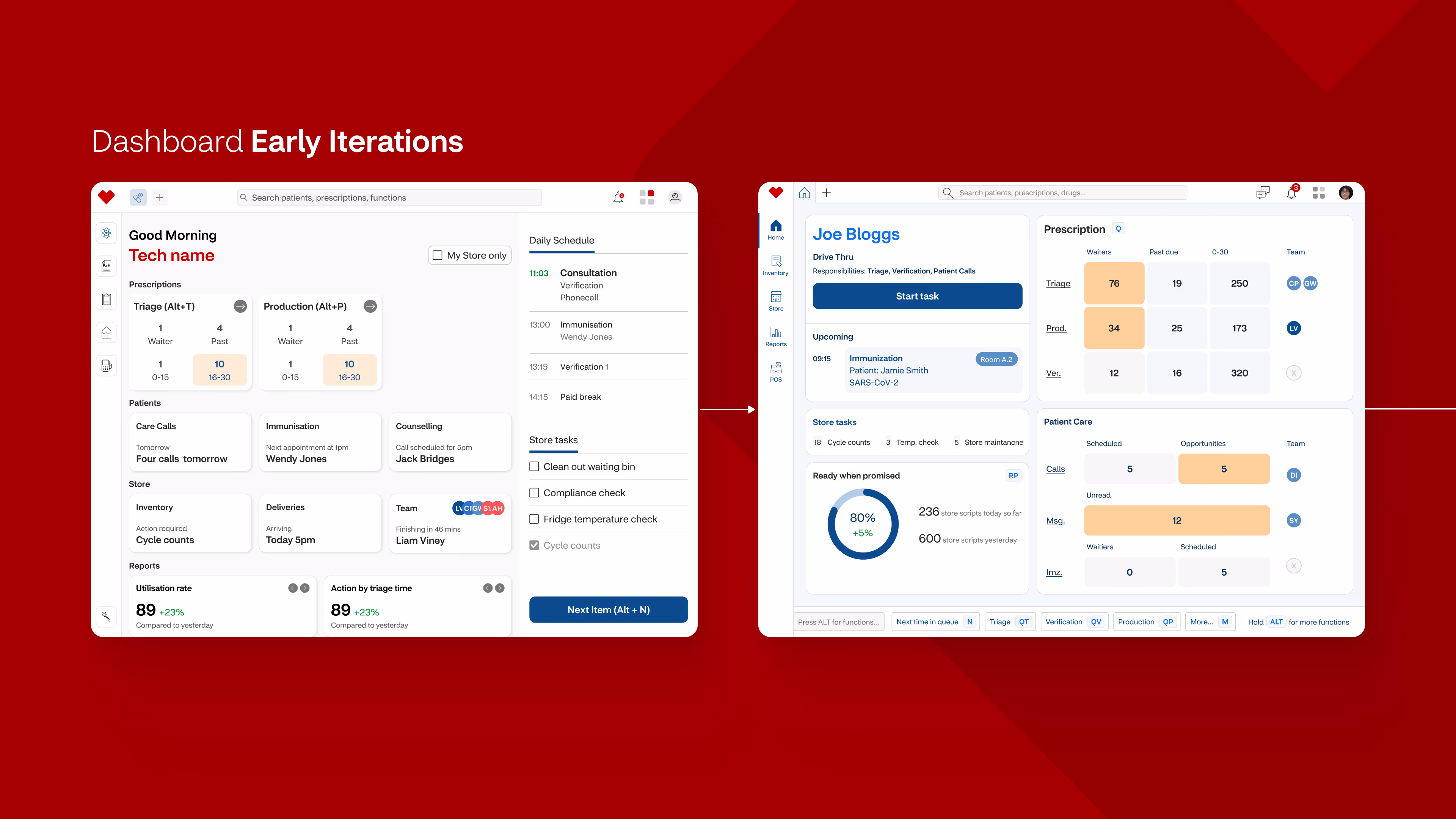
Applying a browser-like model
Before getting into designing the detailed screens and workflows themselves we explored the larger product model.
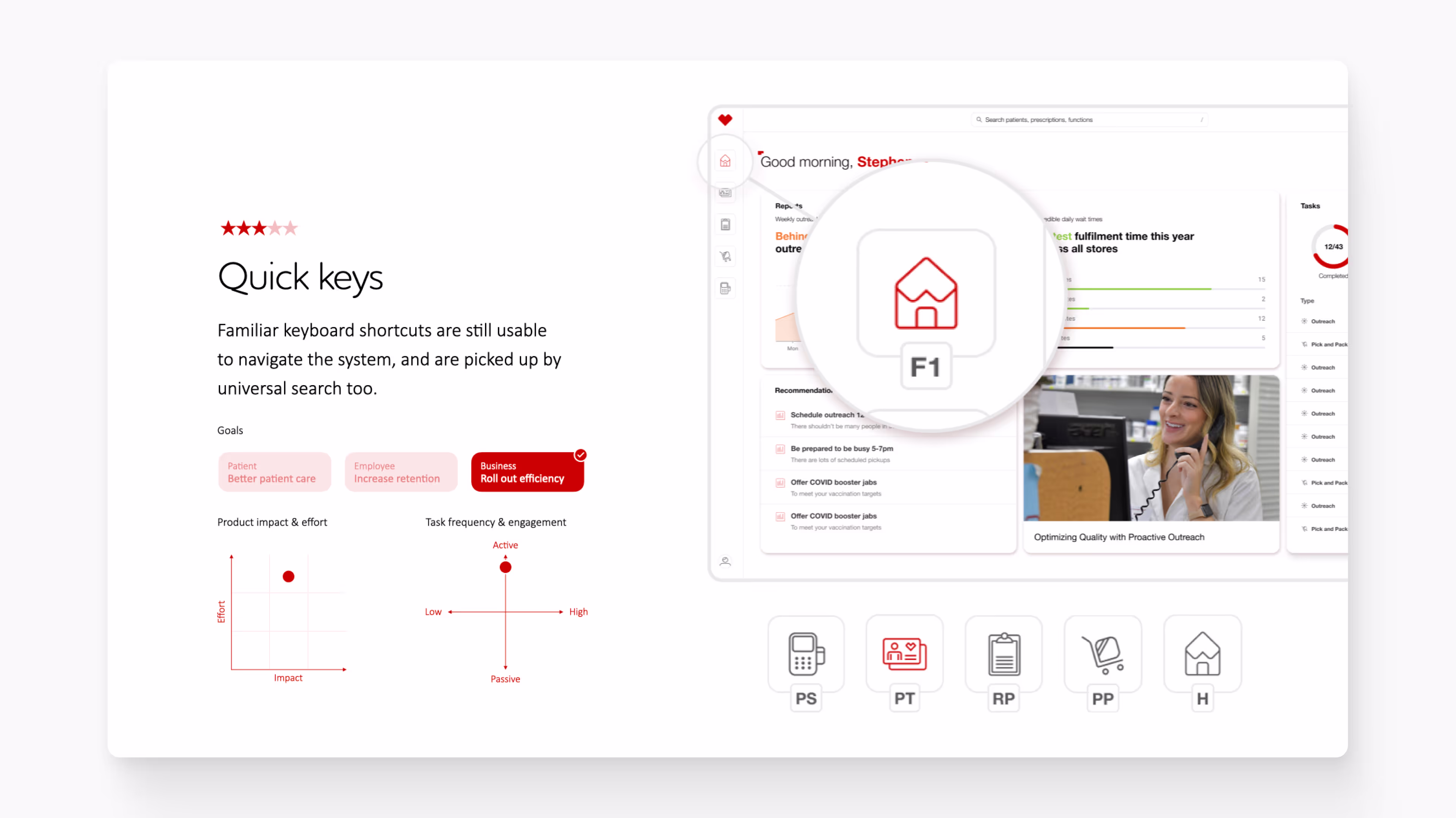
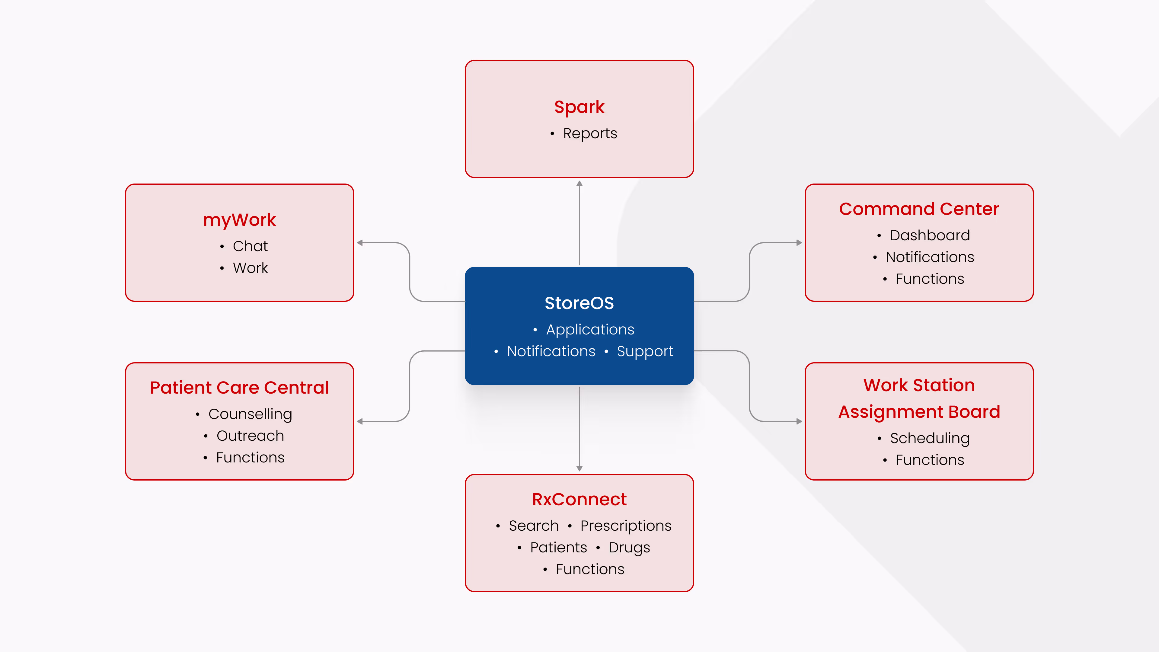
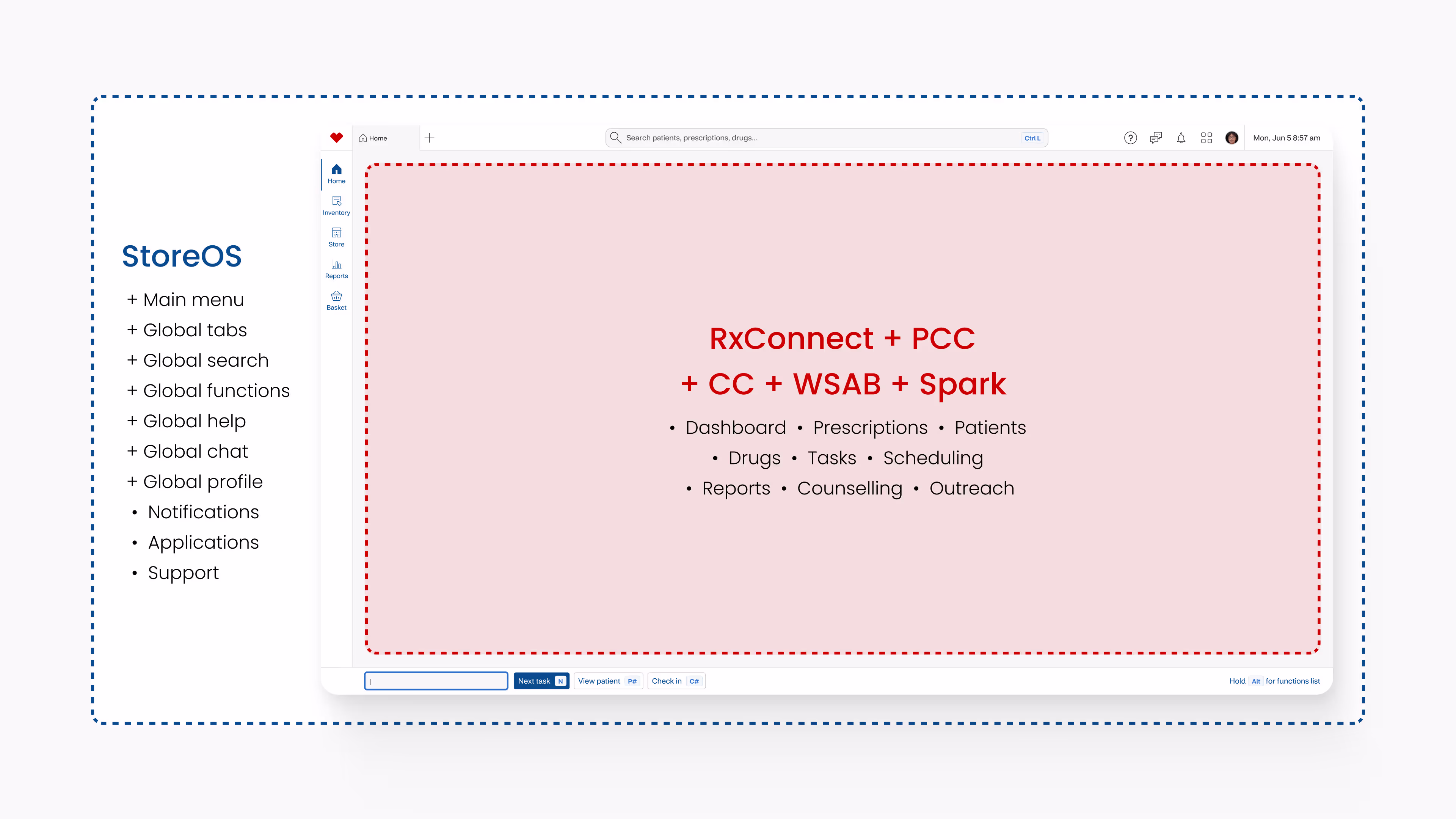
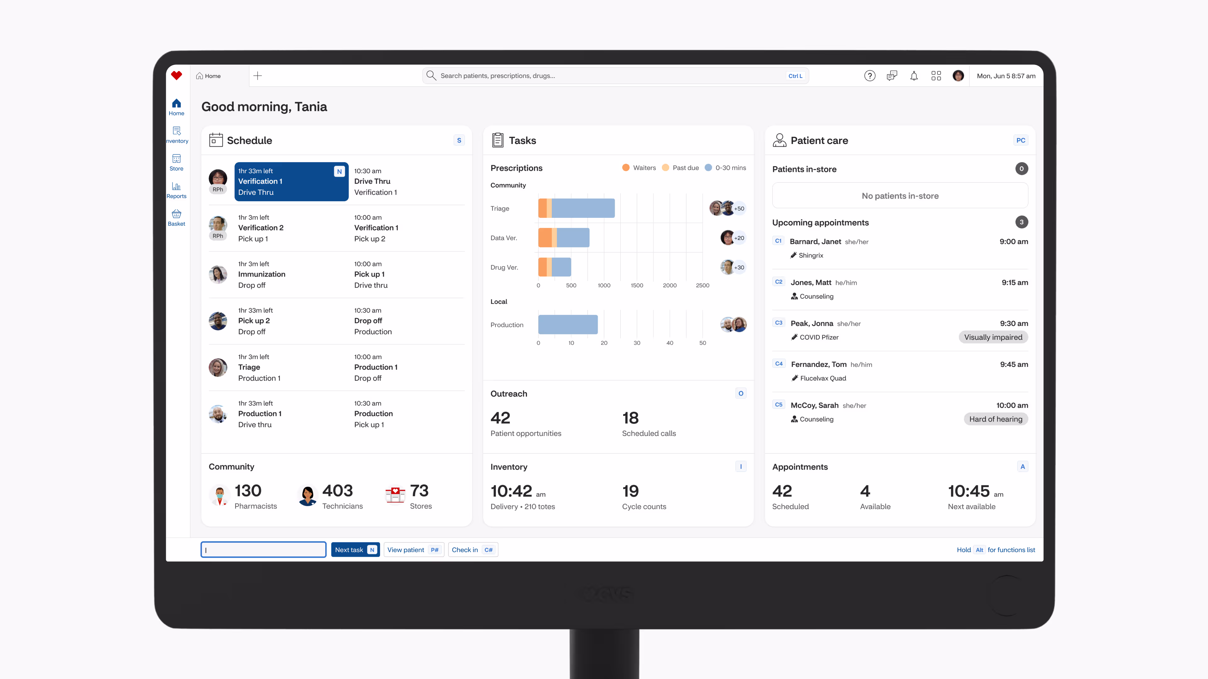
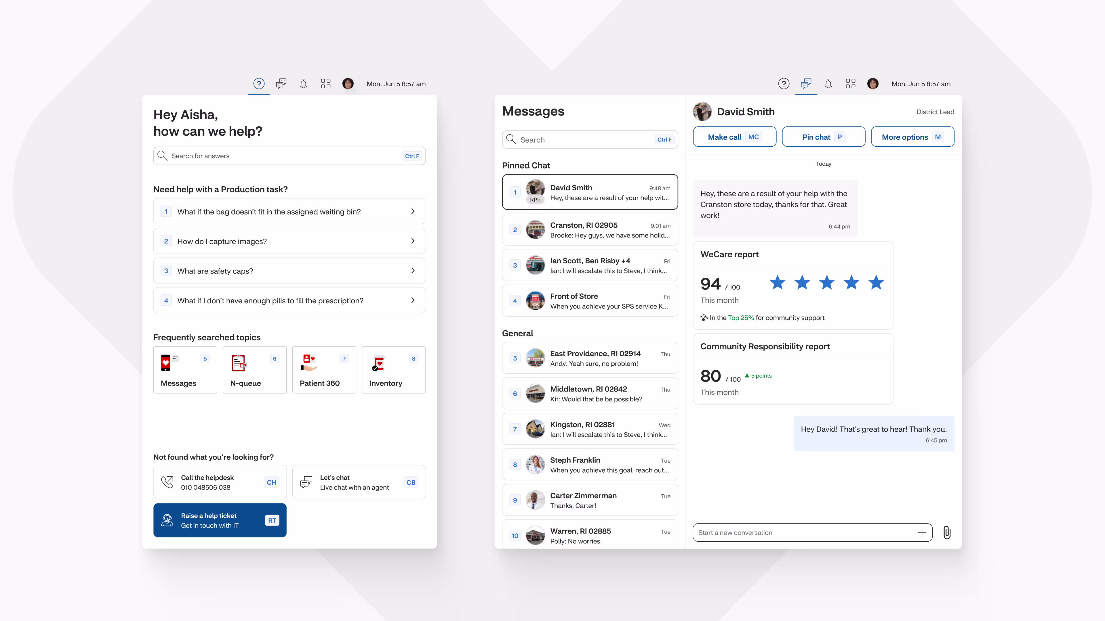
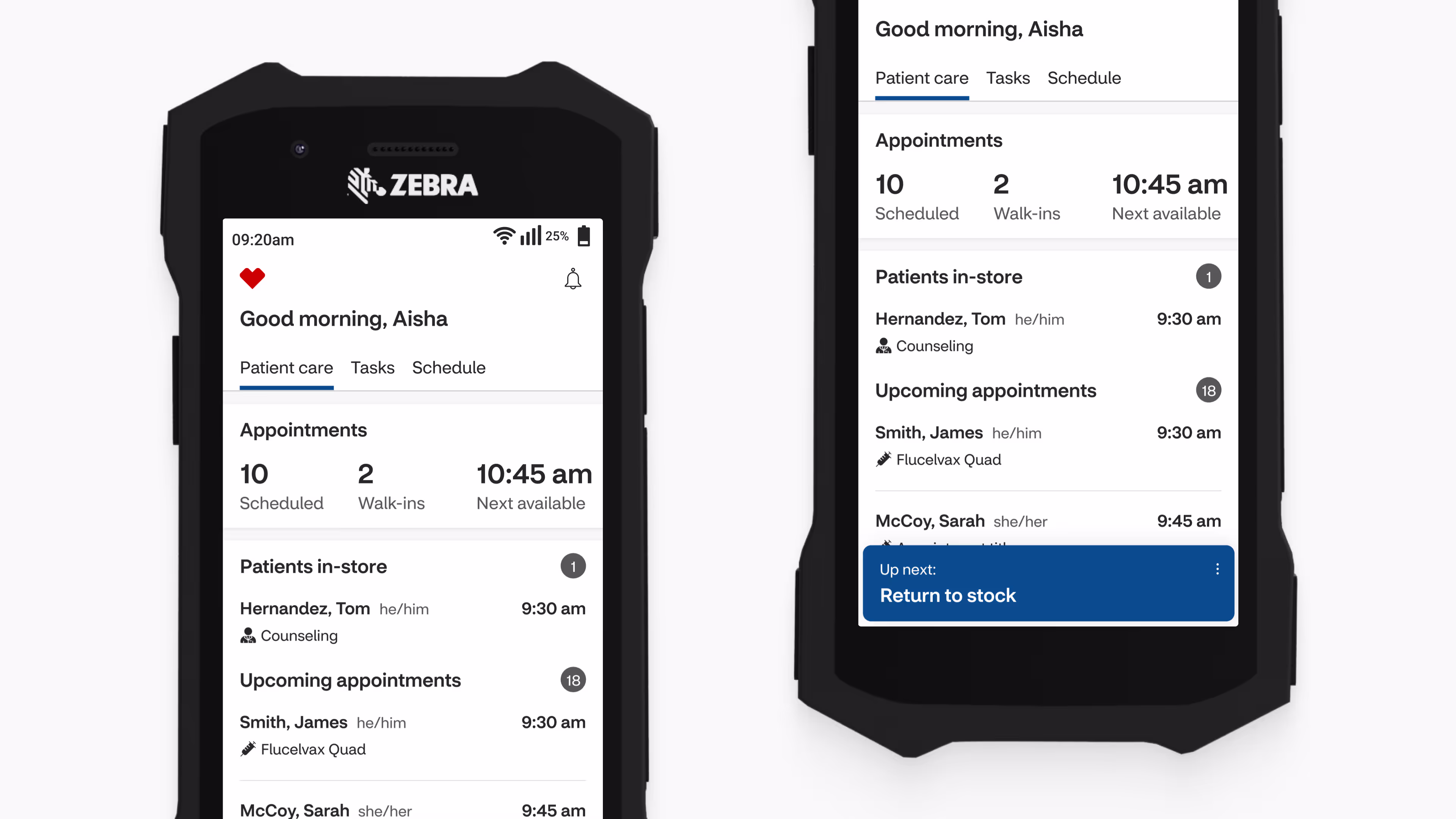
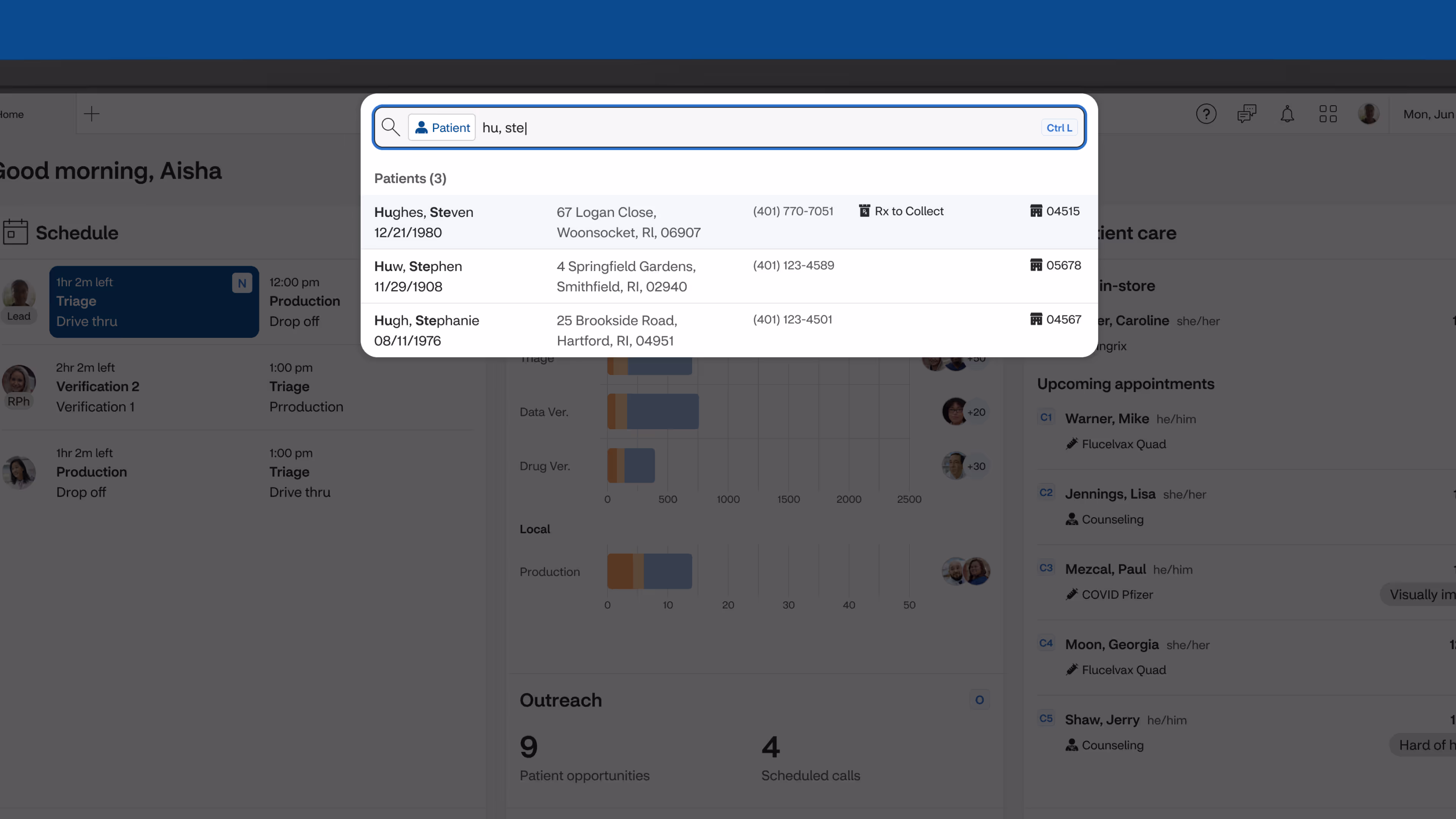
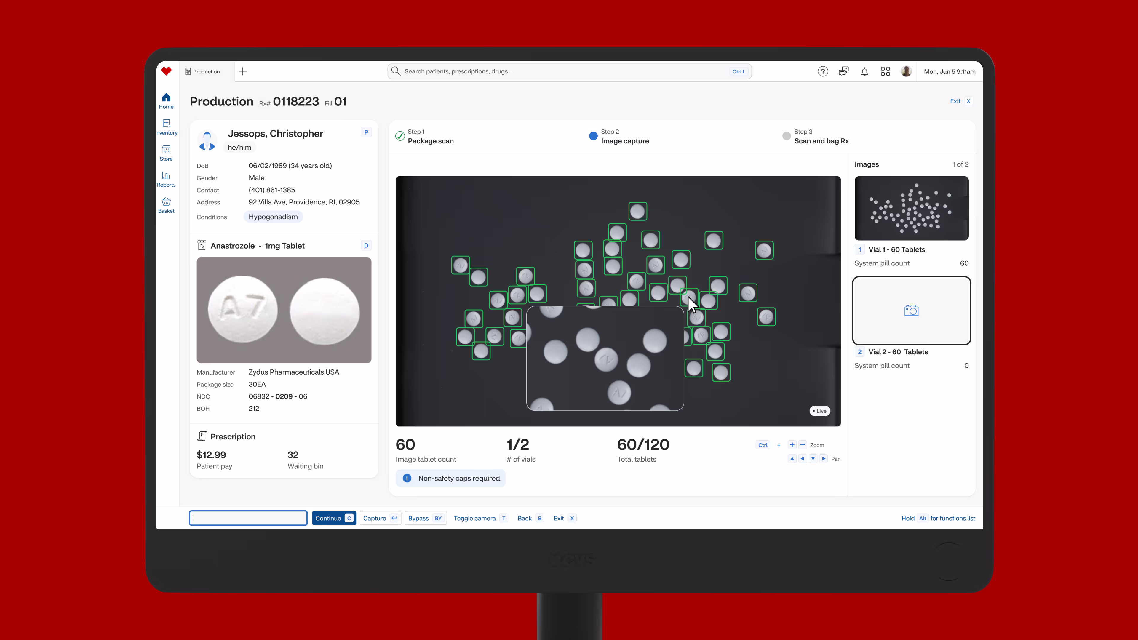
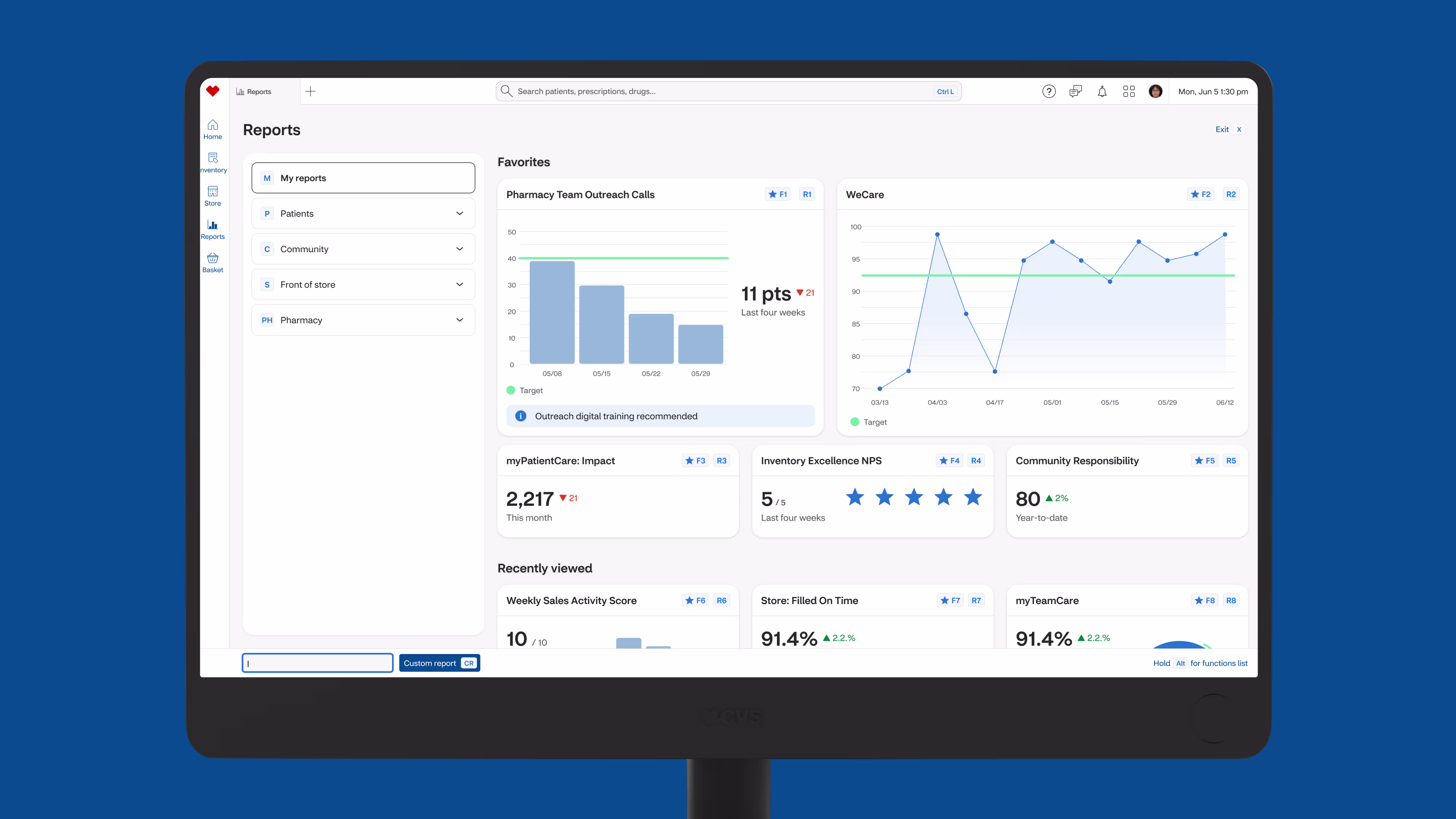
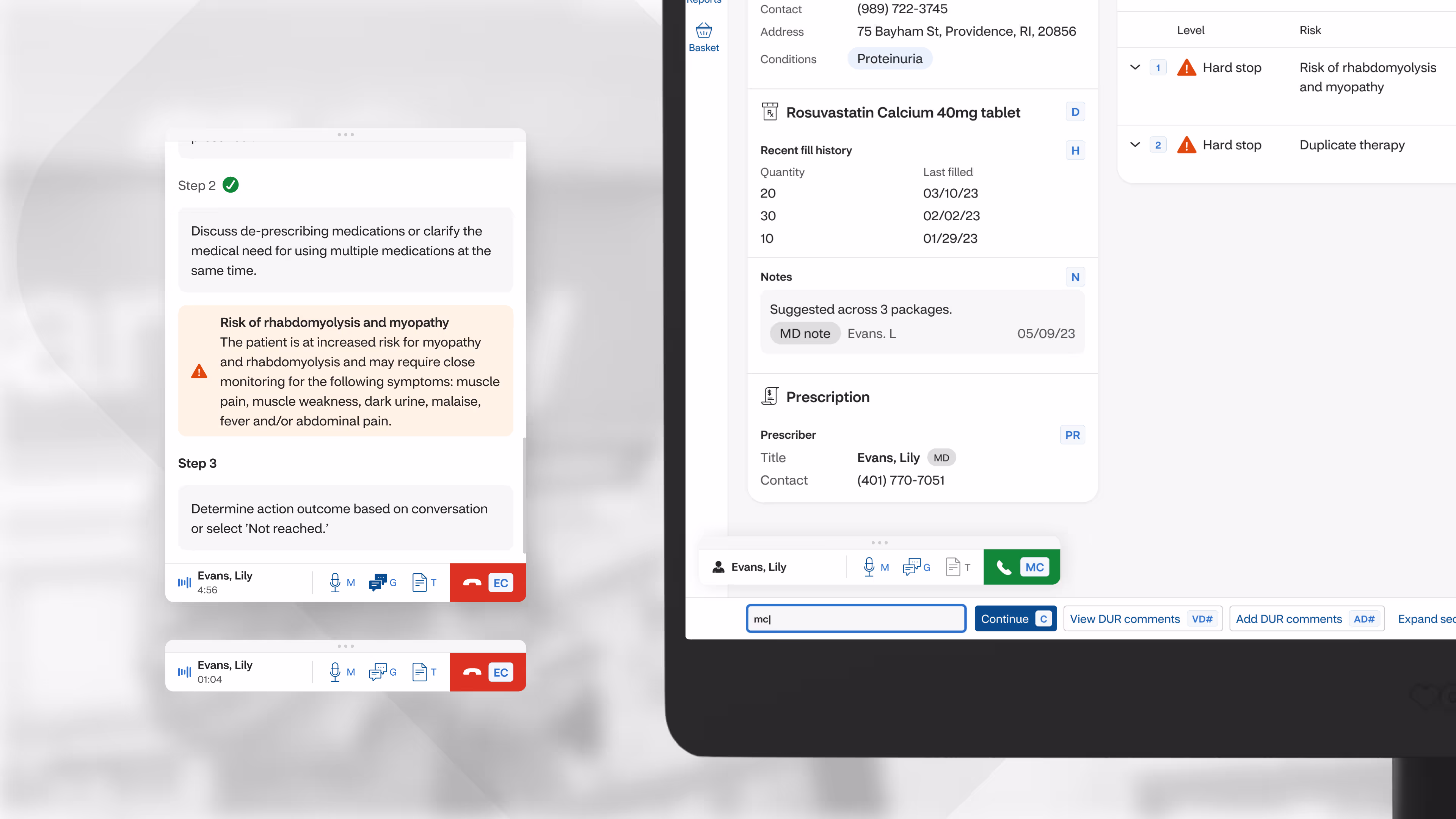
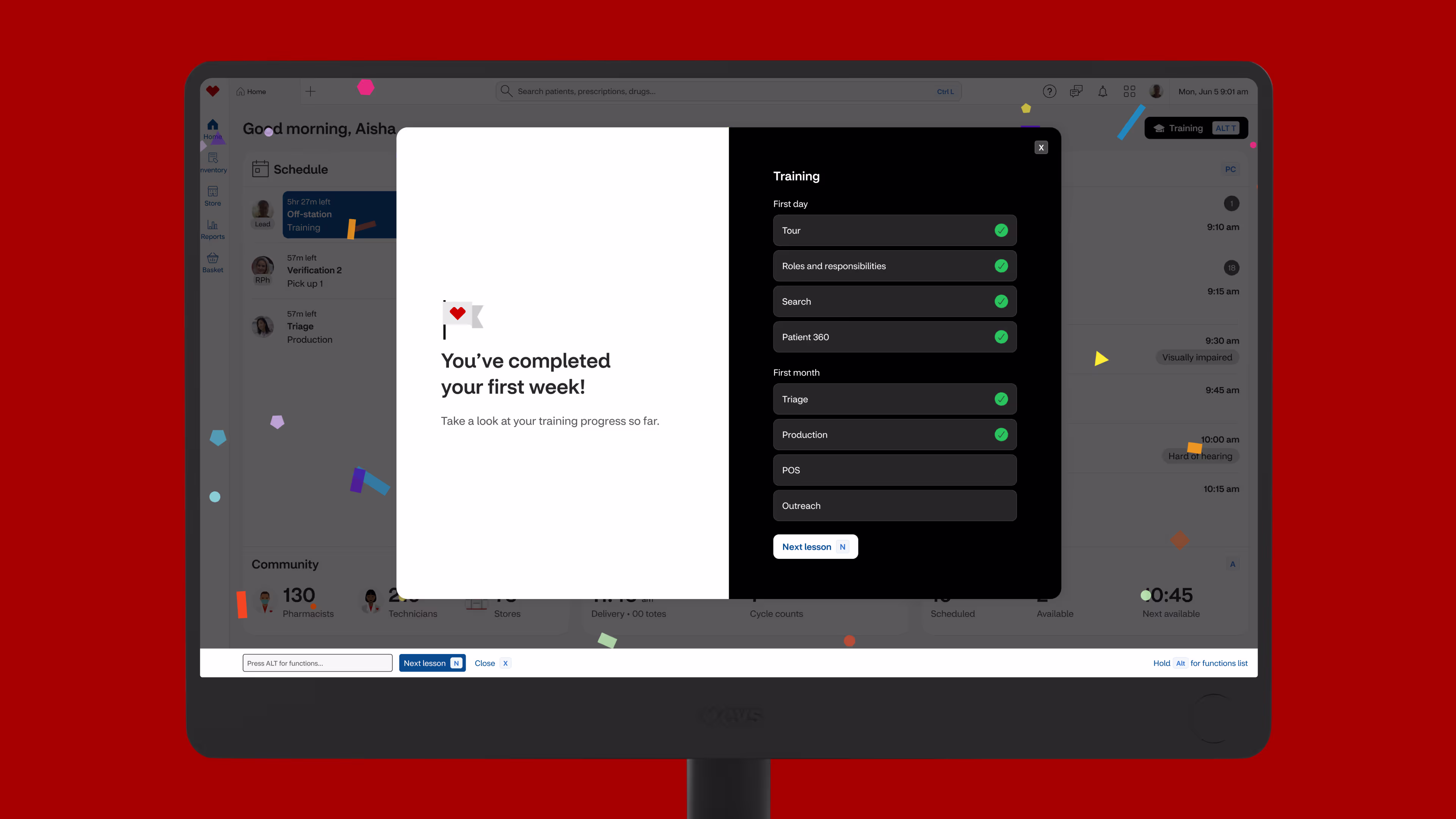
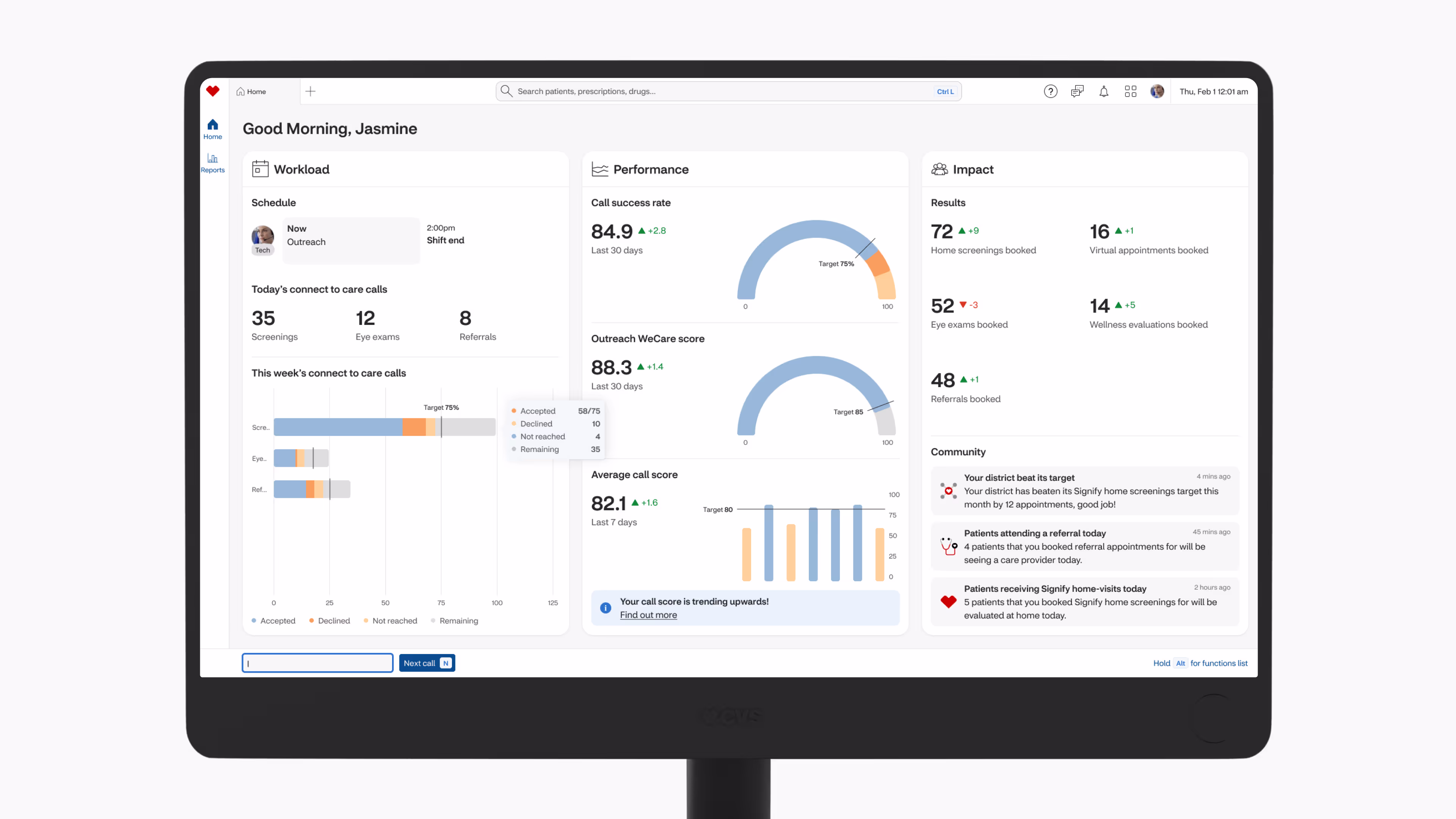
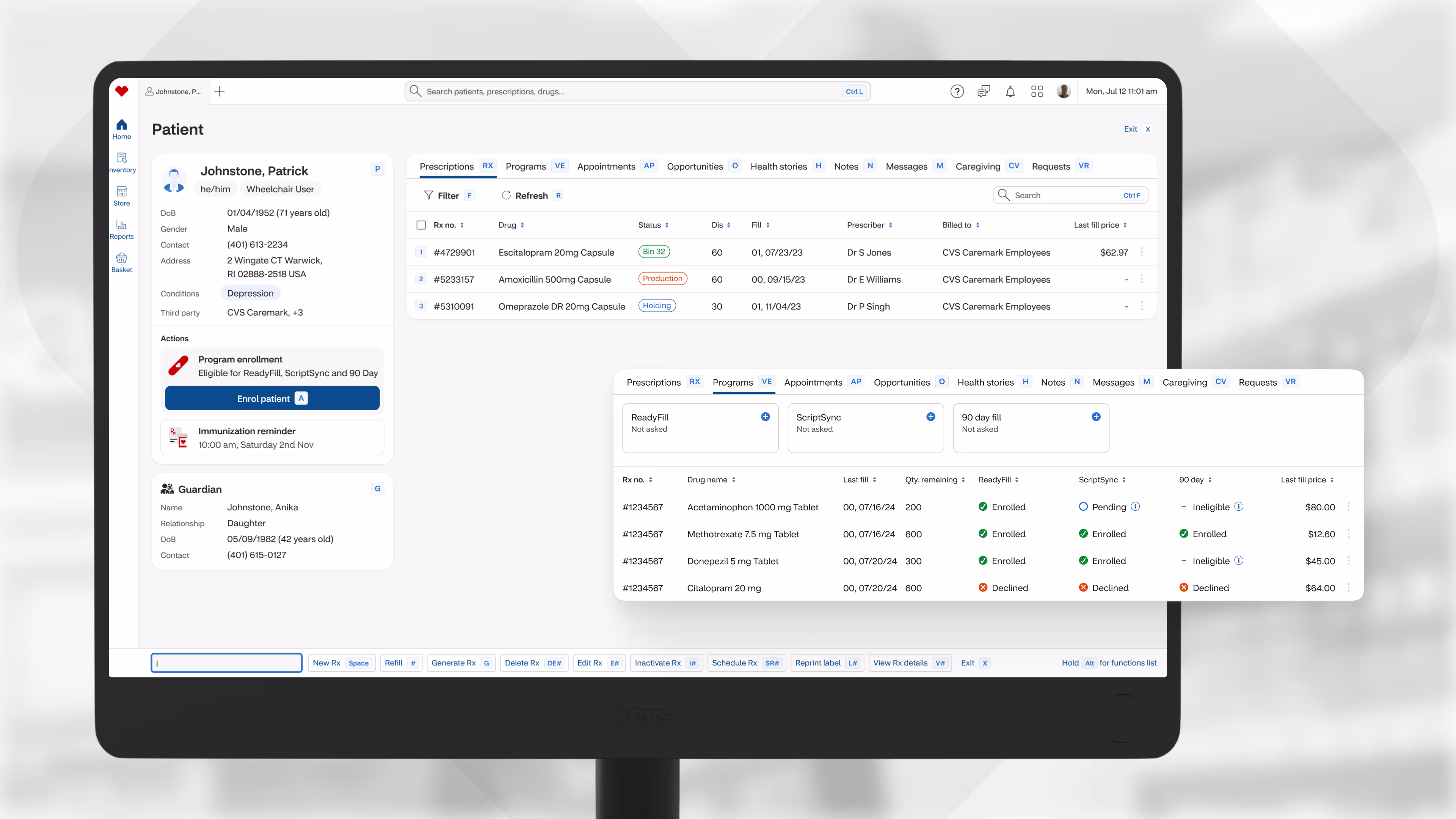
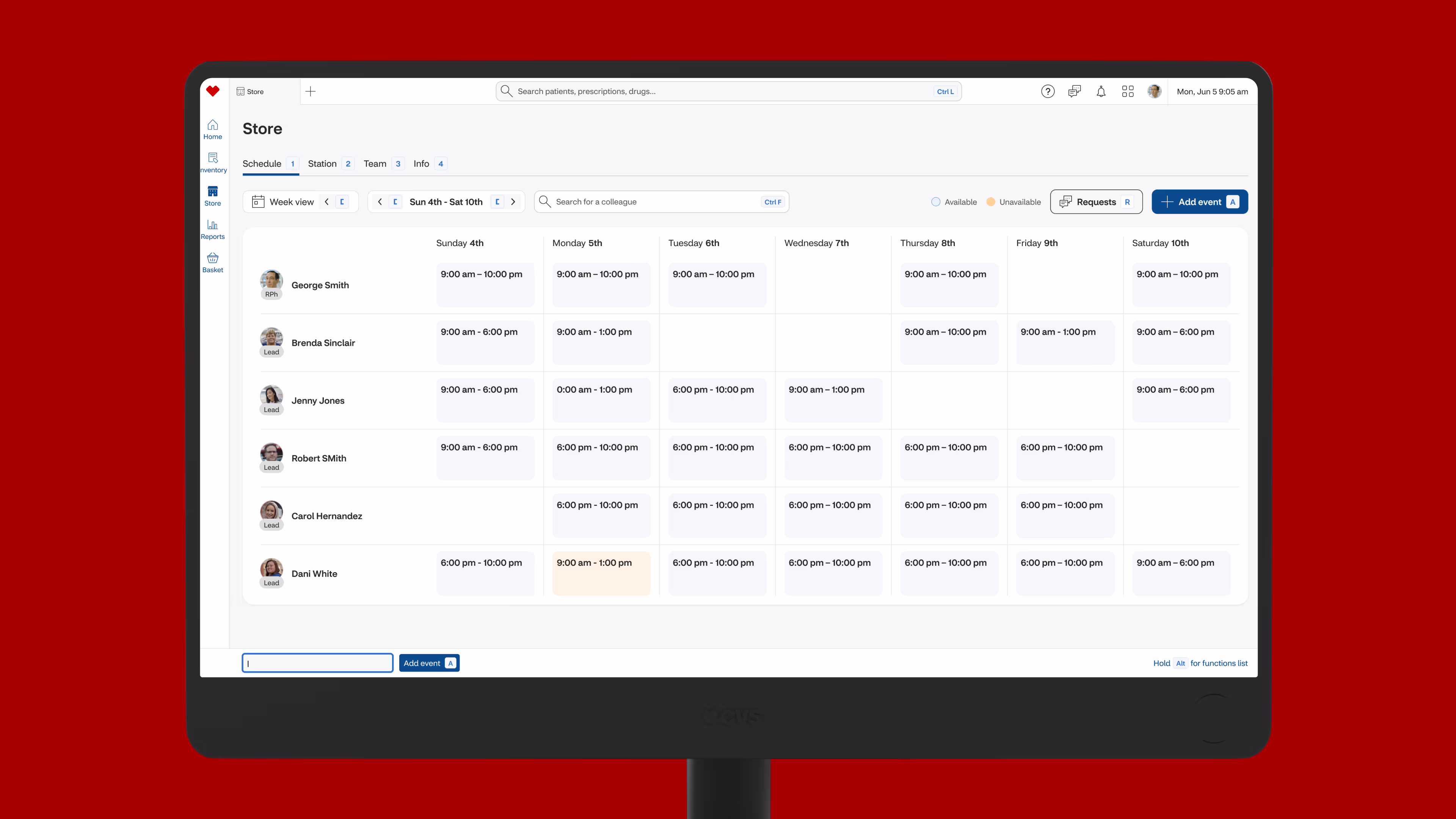
StoreOS would now act like a browser, complete with: tabs, global search, profile, settings, help, messaging, and a bento where other applications could be easily accessed. Just as with a regular browser, users could easily navigate back and forth through screens.
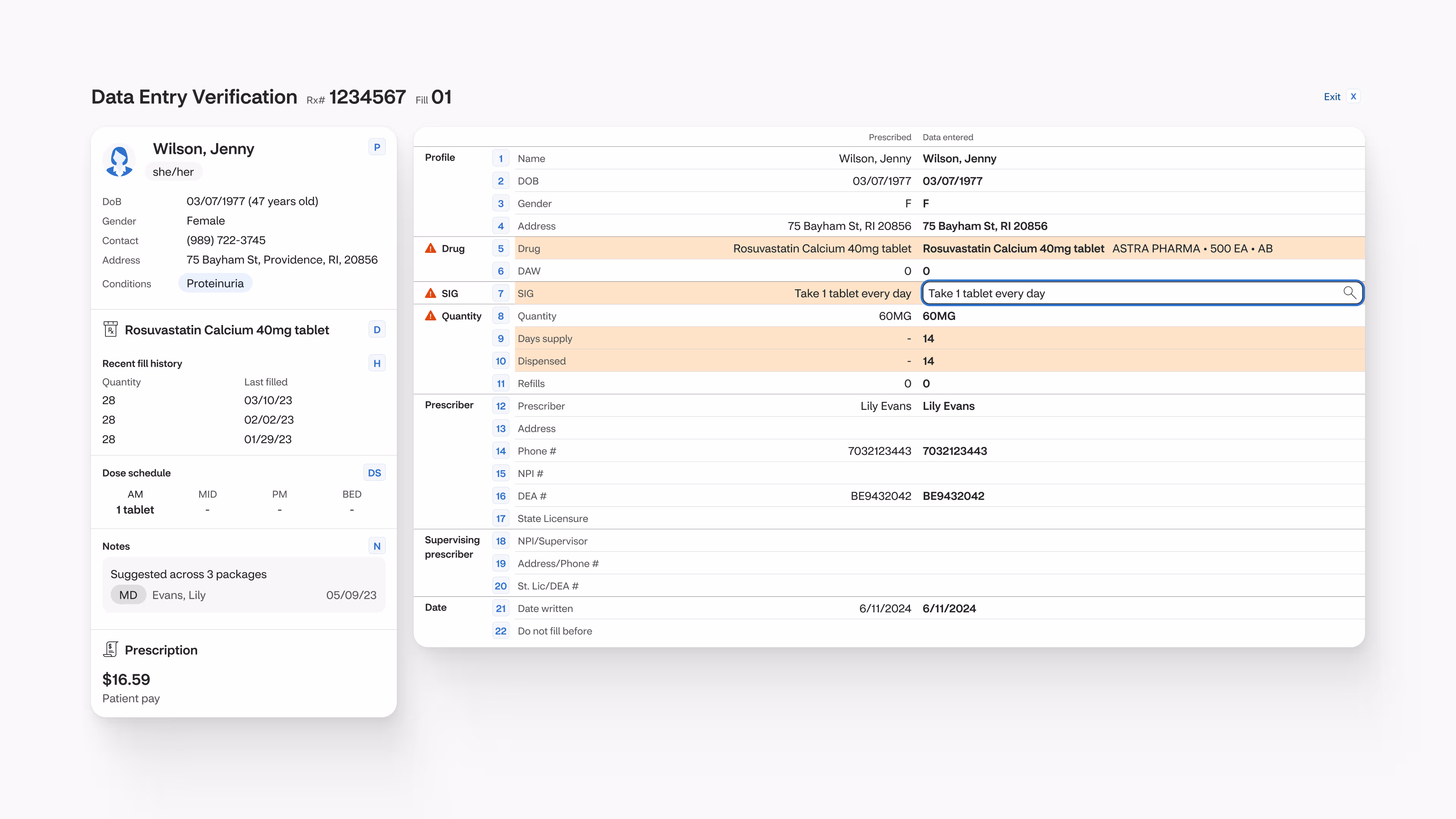
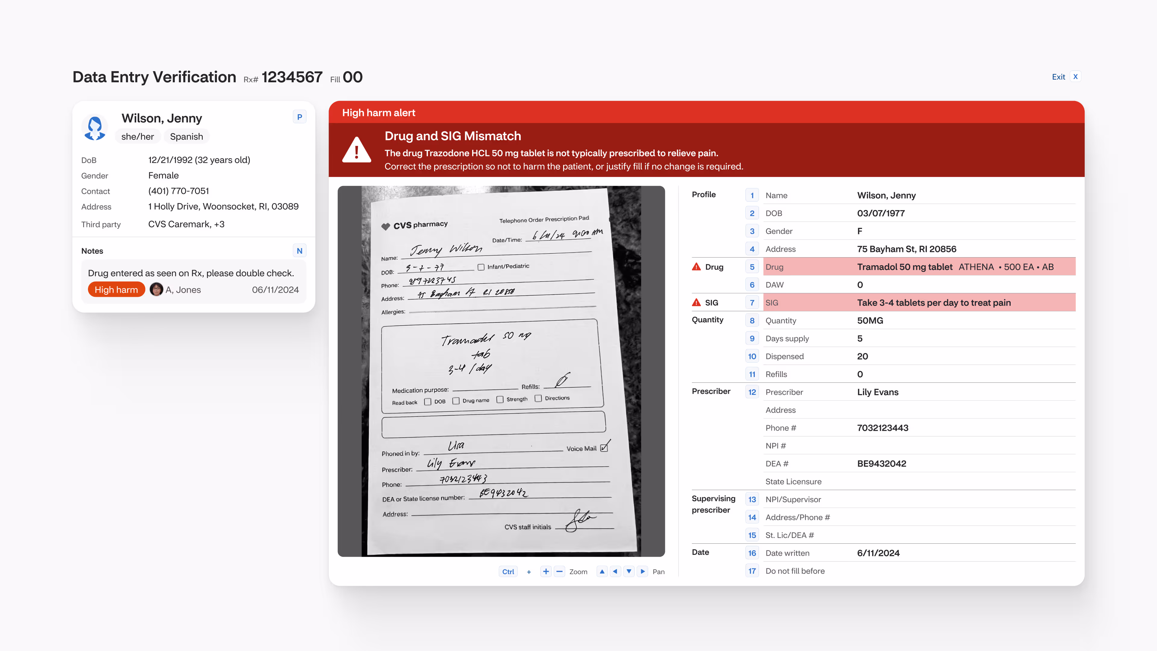
Everything below this would be RxC, with the sidebar allowing users to easily switch between different sections and the function bar running along the bottom enabling power users. Command Center would become the heart of the new RxC, acting as a dashboard and launch point. PCC would become a type of task within RxC.
The Colleague Expansion Pack
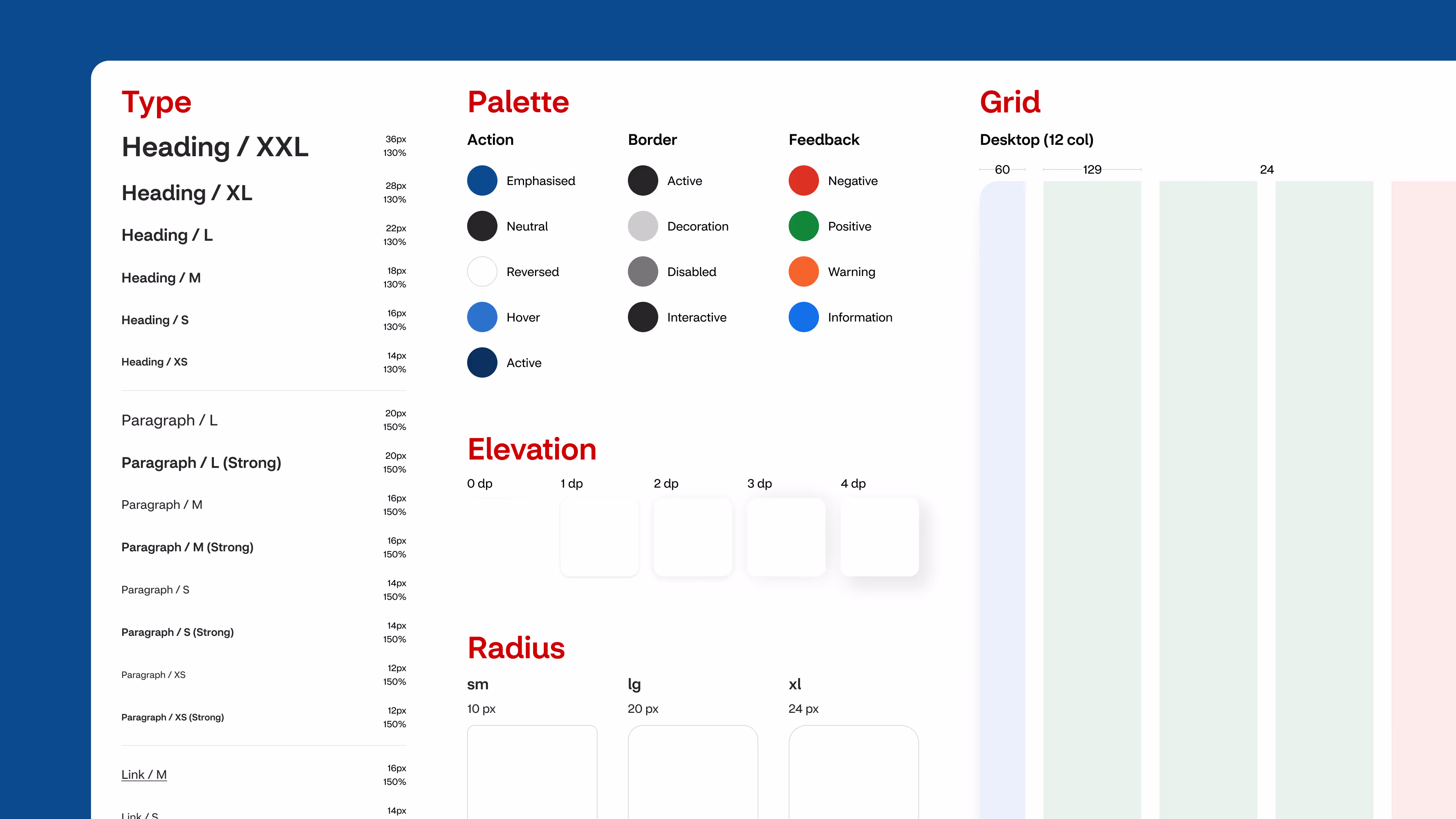
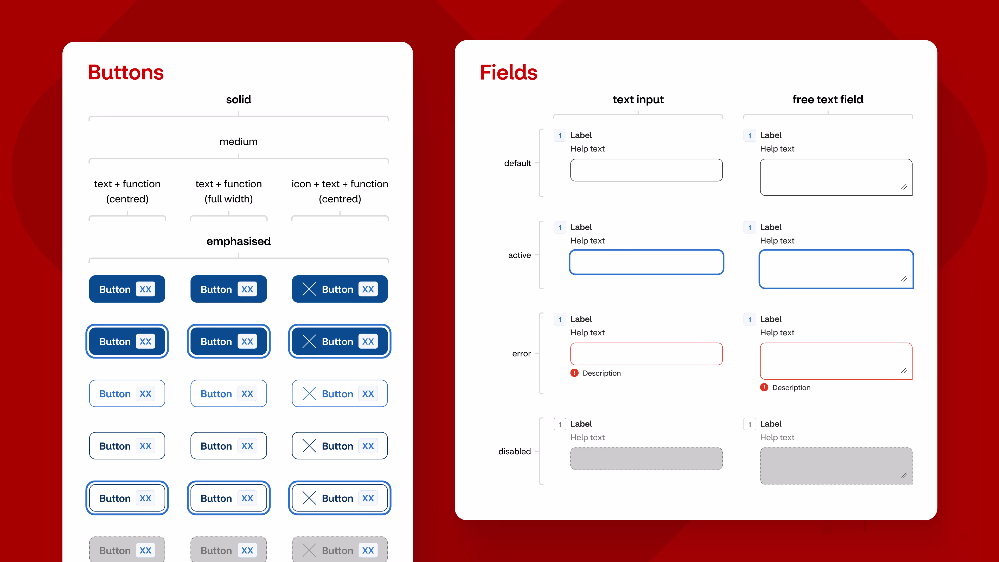
A design system was constructed alongside the project that added on to the existing CVS Health design system – an “expansion pack” of sorts. The existing design system was web focused, acting as a foundation for us to build from, but it wasn’t comprehensive enough for digital products.
The foundation of our expansion pack was built on semantic tokens, reinforcing consistency across the expansion pack and designs. We applied atomic principles with components scaling from atoms through to page templates. Grids, typescales, palettes, and styles were also defined, with tokens used where possible.
By utilising existing assets we were reducing time and cost to design, validate, and build. The expansion pack allowed us to work quickly without fear of impacting the existing design system in place. We were also able to apply our own best practices.

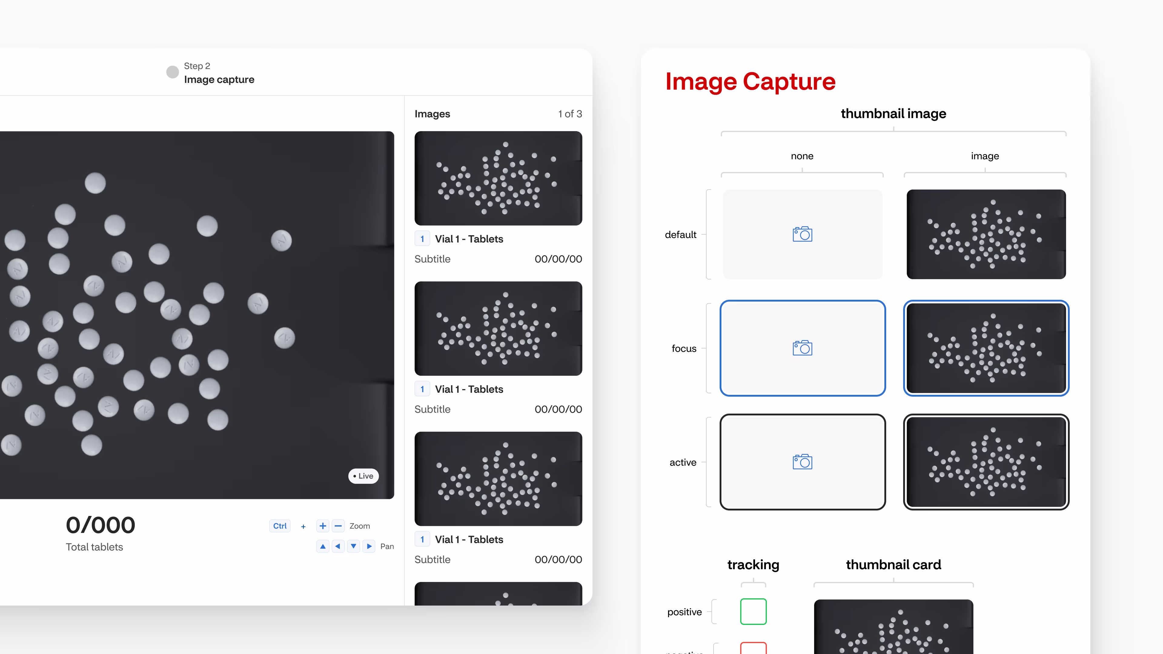
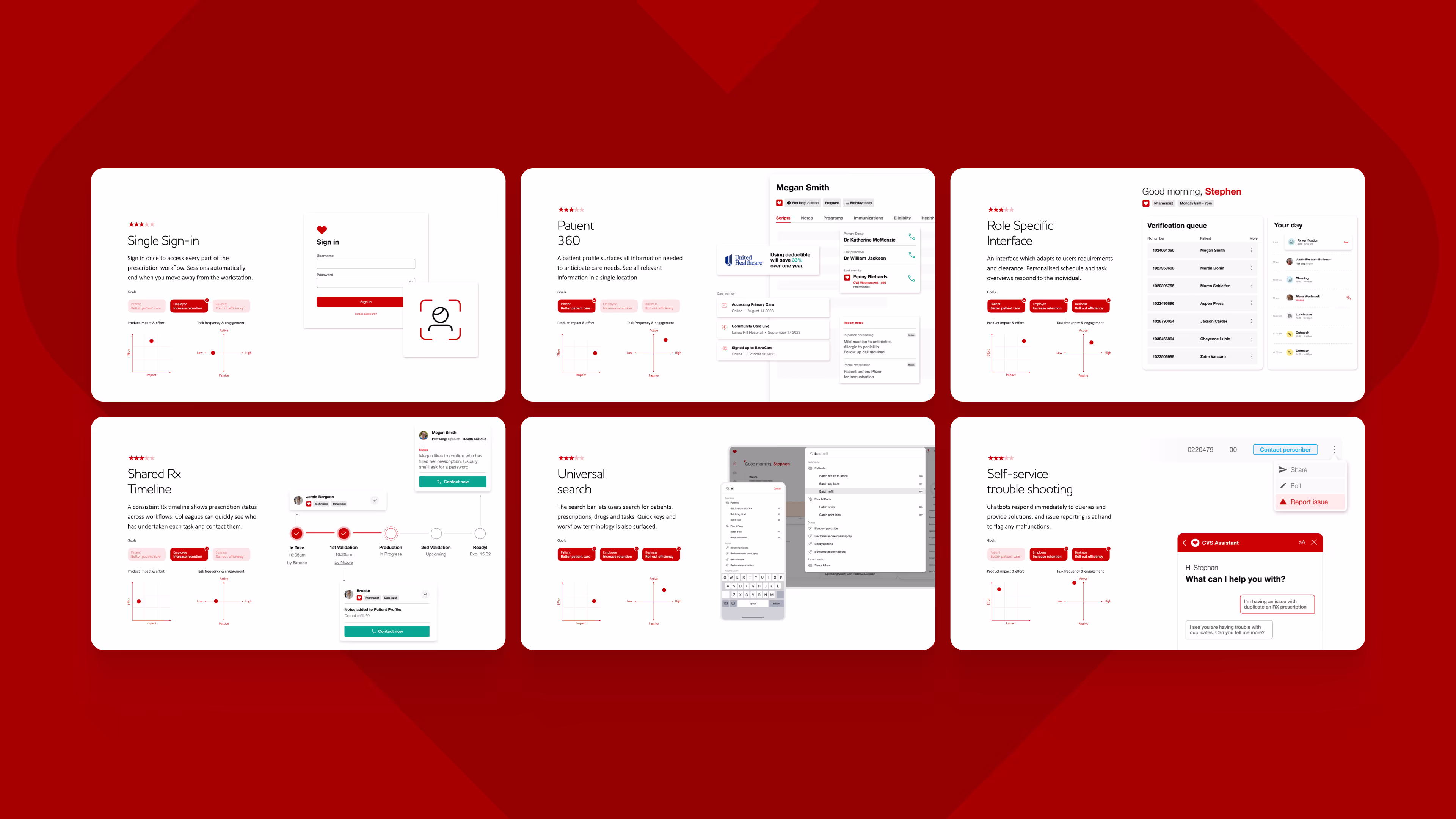
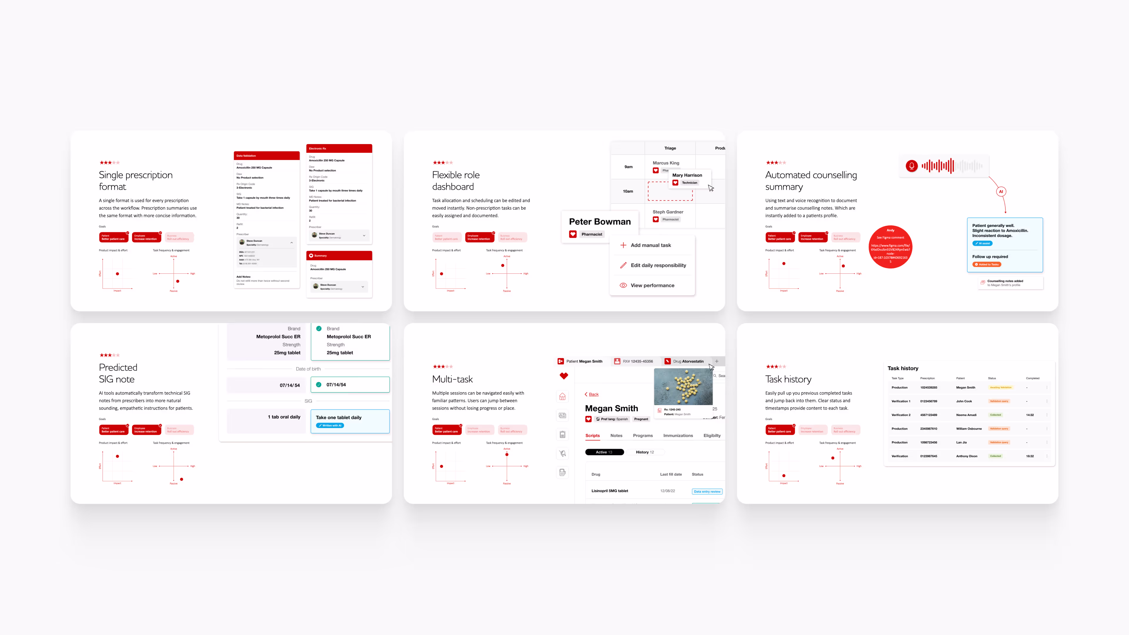
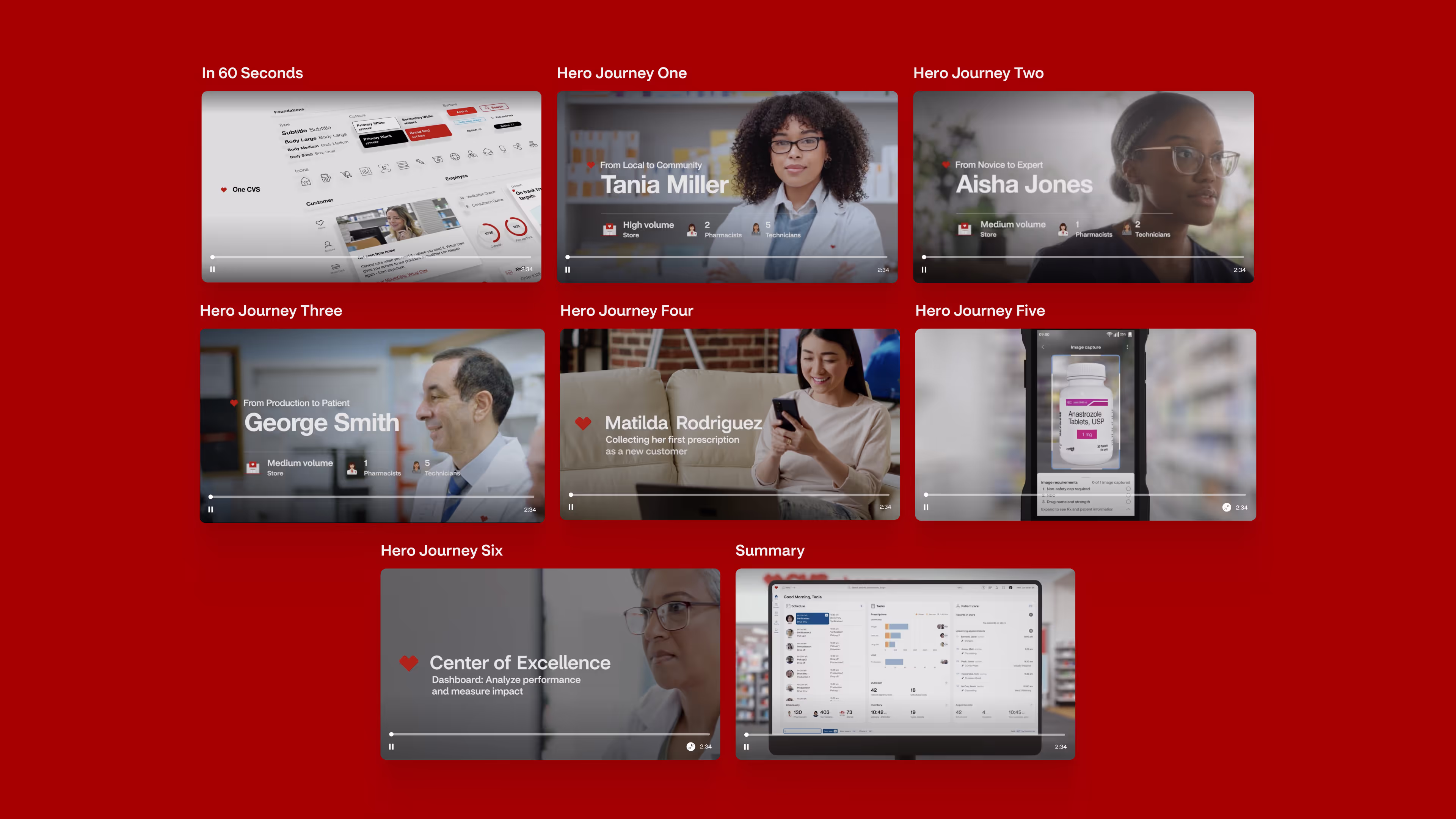
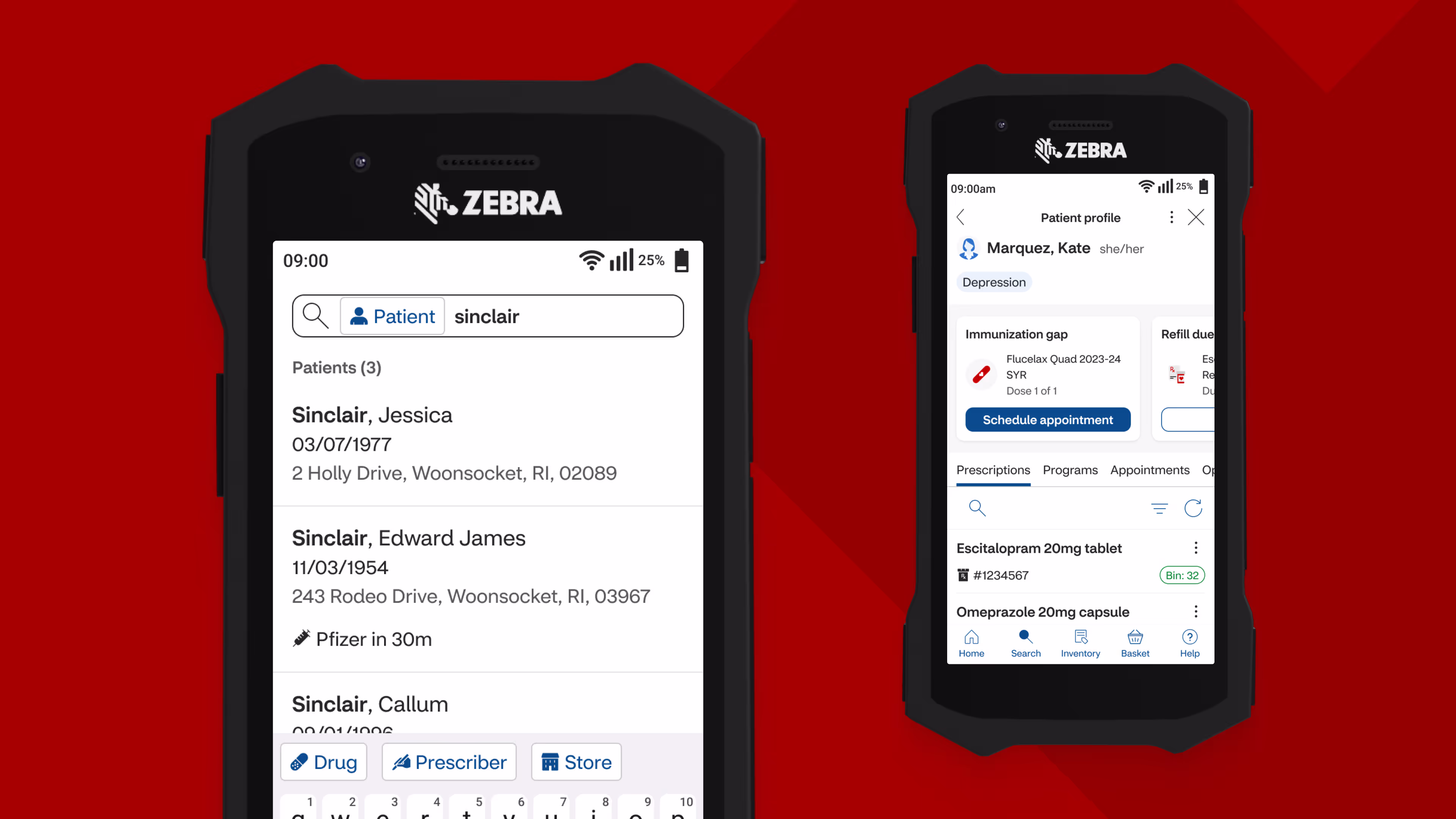
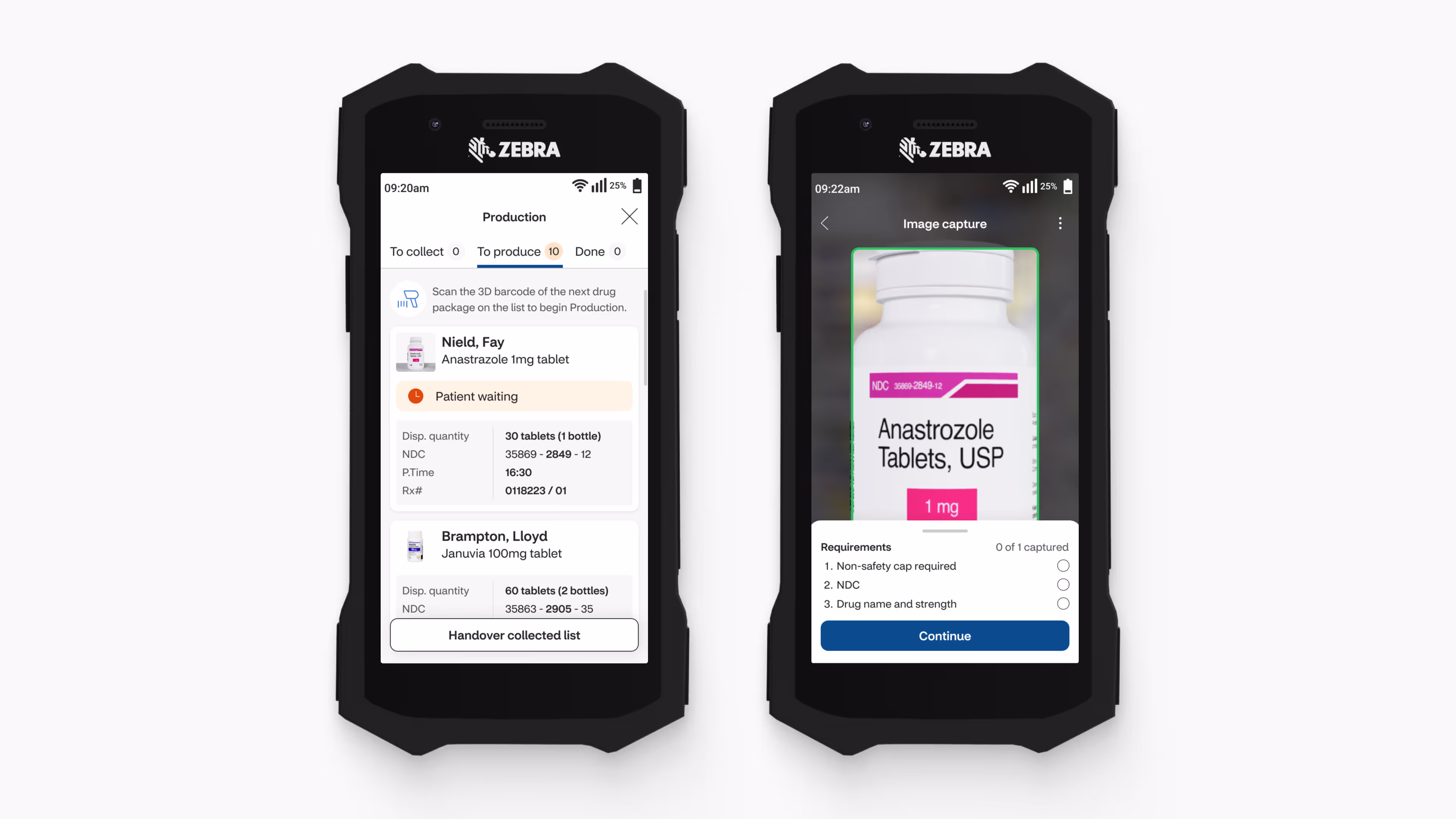
Six hero journeys following the colleague experience
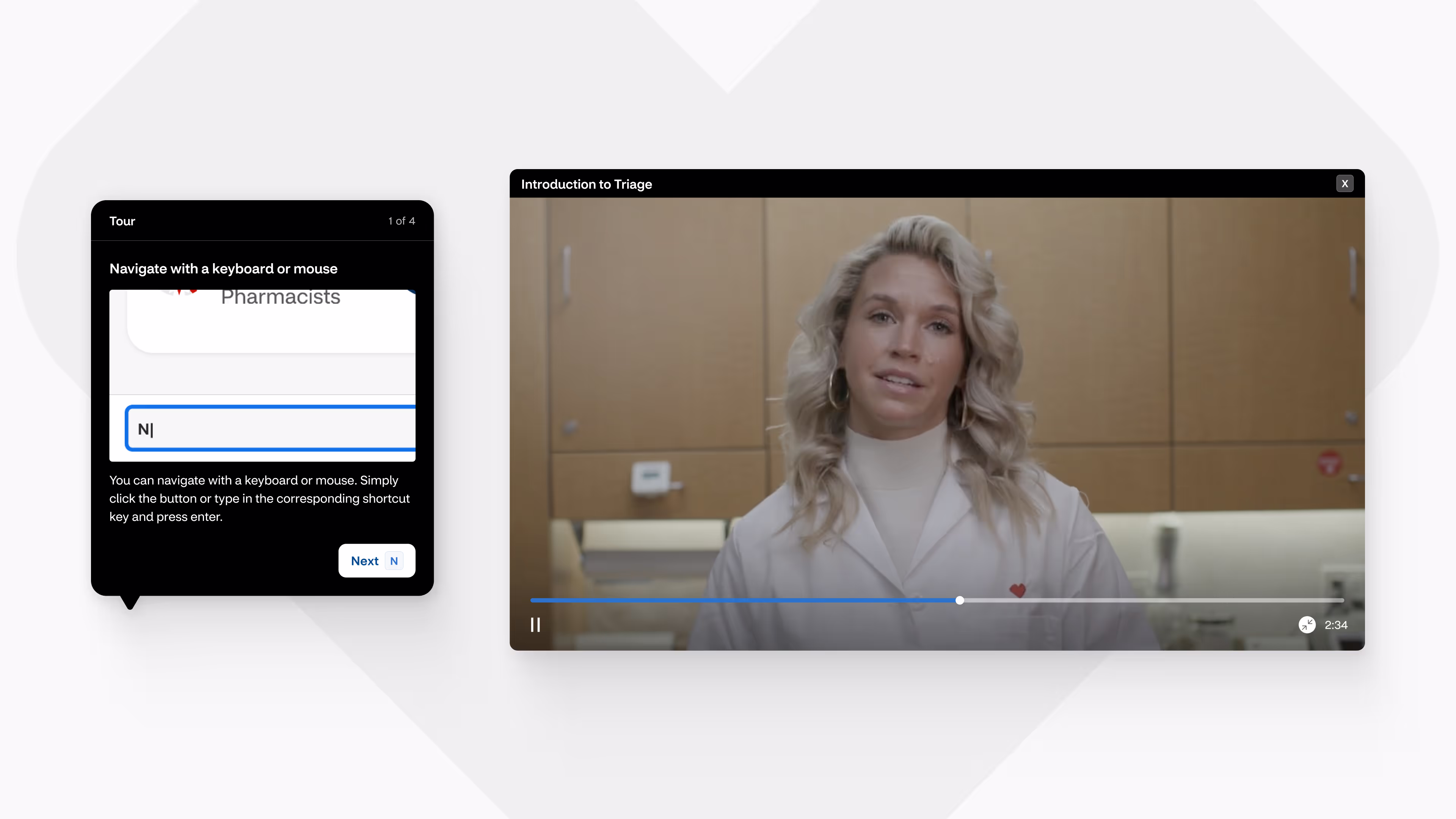
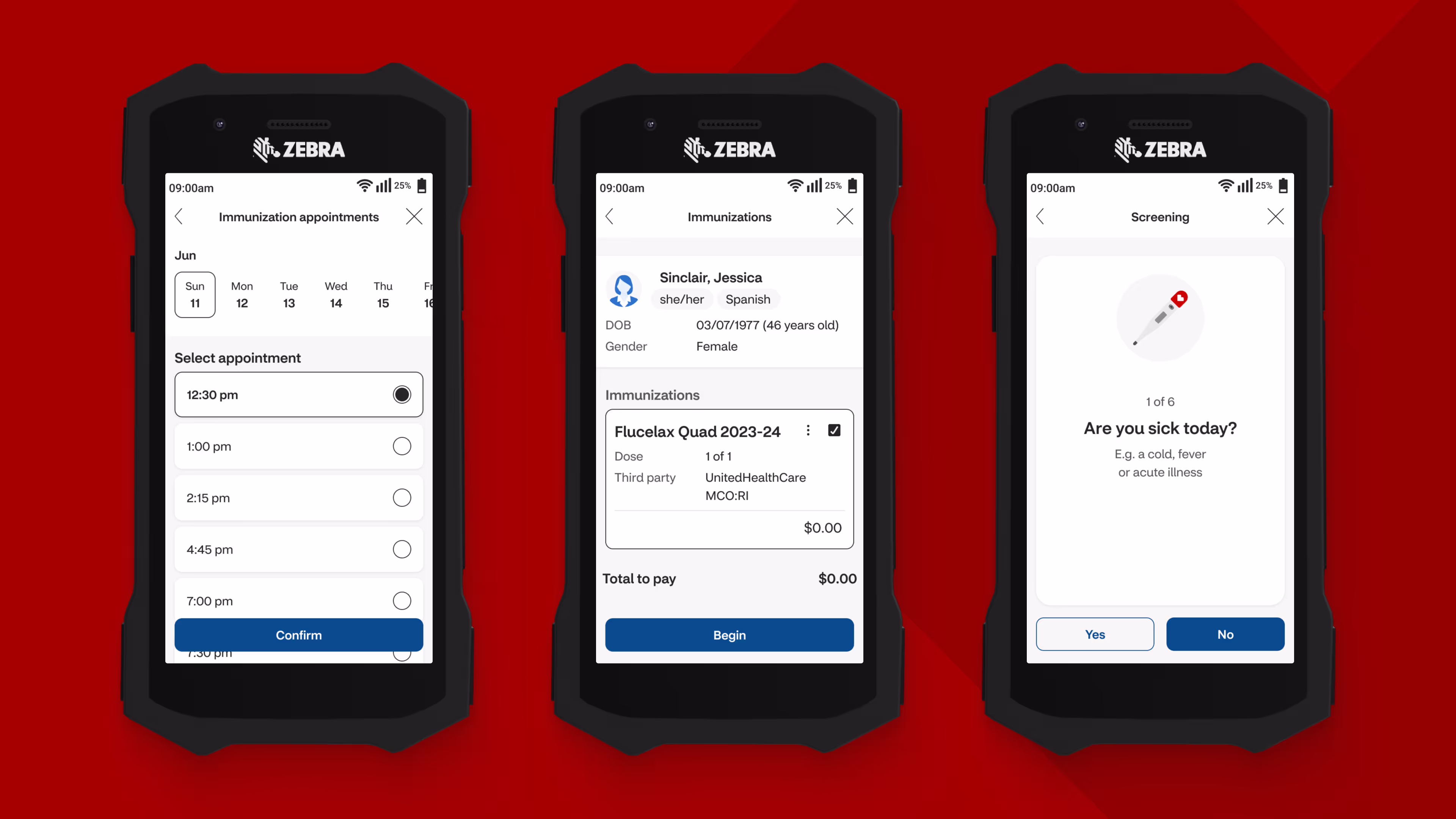
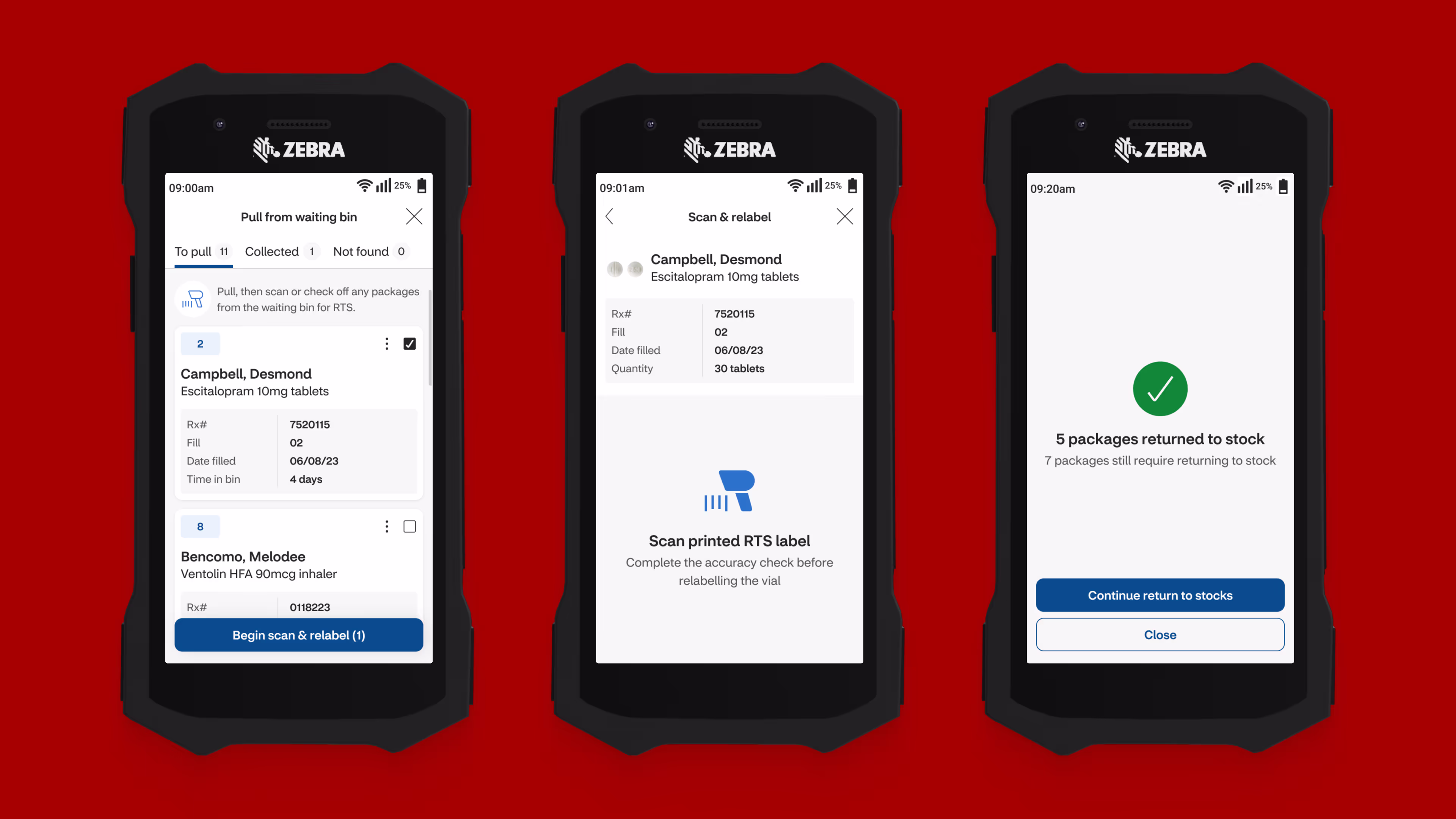
To explore as much as possible without getting bogged down in the enormous complexity of the existing systems we decided to create six hero journeys. Three in phase 1, and three more in phase 2 of the project. Each hero journey spanned multiple existing and high impact processes whilst weaving in new concepts to illustrate the enhancements we were making to the day-to-day workflow.
Each hero journey was complemented by a video, connecting the designs to real life scenarios and showing various interaction patterns. Alongside this, a React prototype was developed for each workflow allowing us to simulate and validate our design decisions.
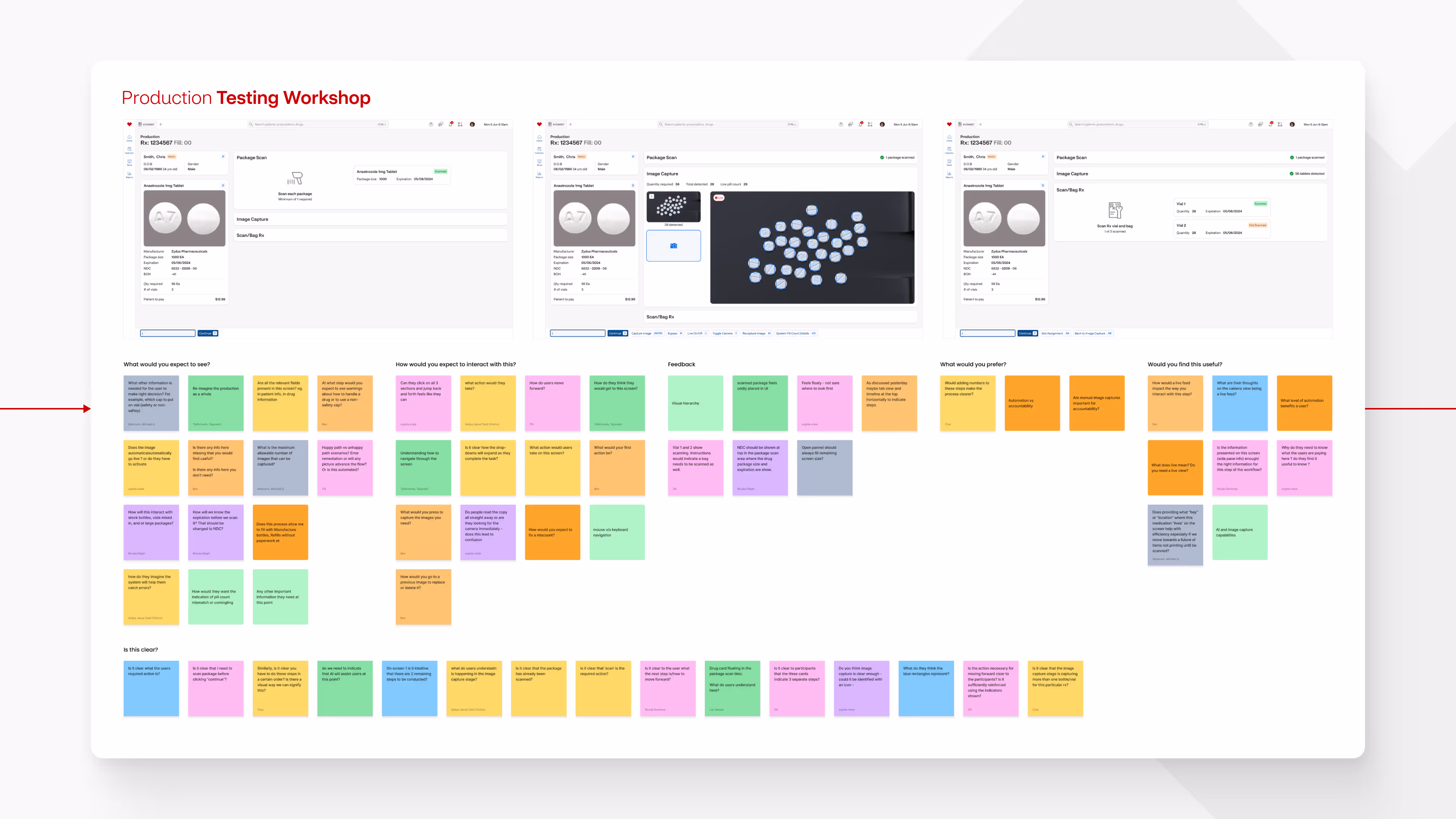
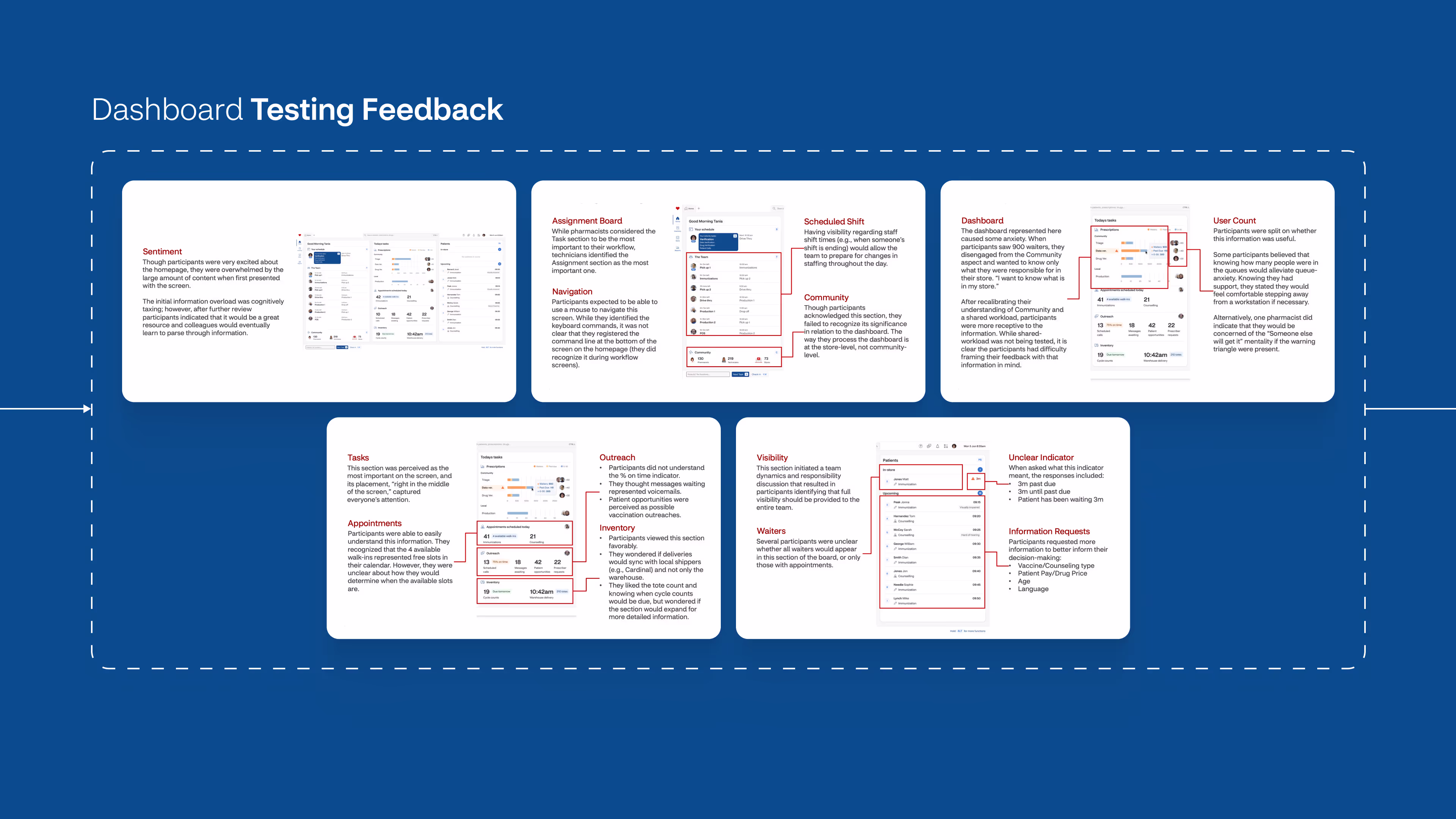
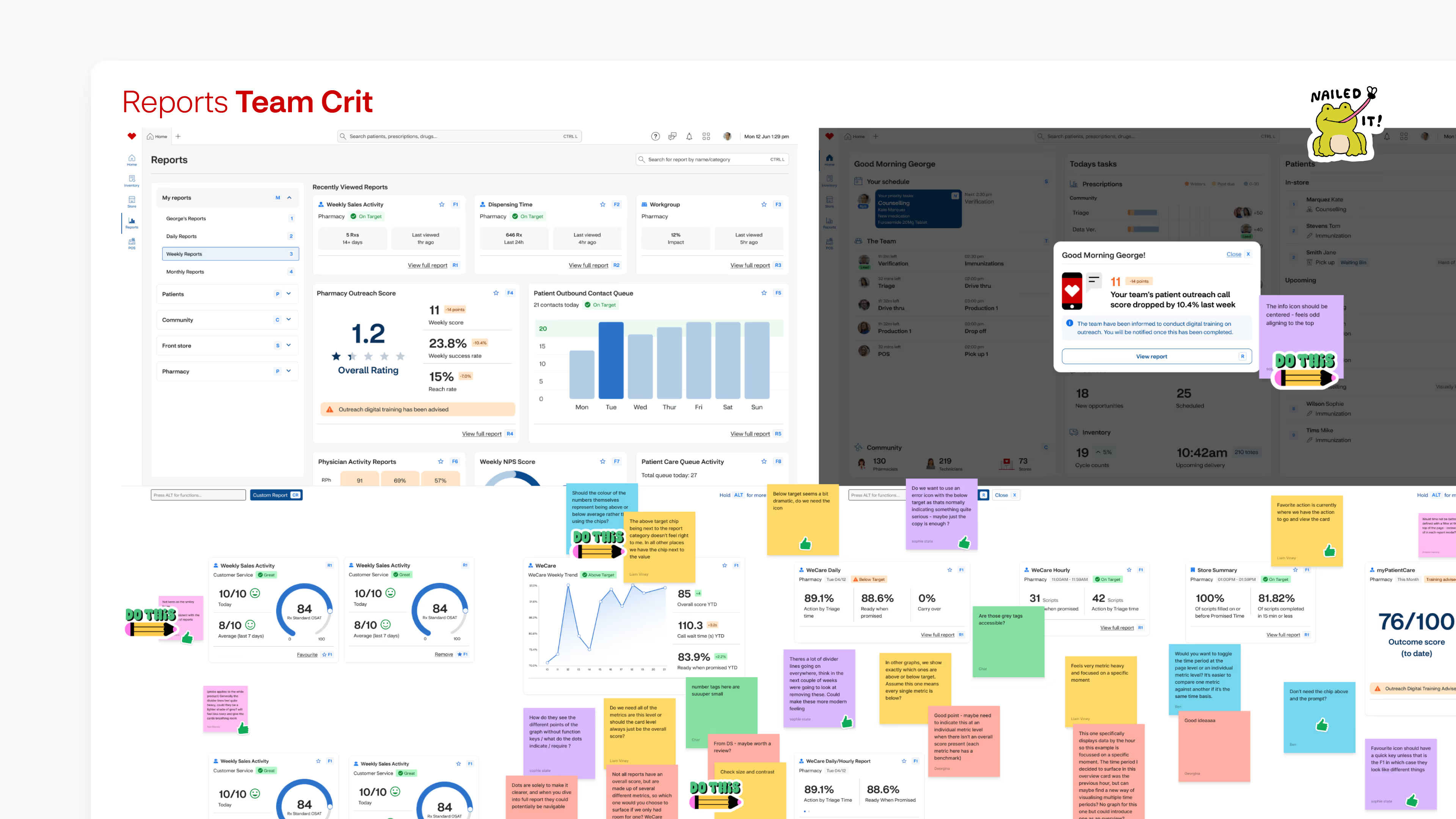
Team crits, weekly presentations, a 24 hour feedback loop, and end-of-sprint user testing
We presented our work to key stakeholders weekly and given their experience as pharmacists and technicians using these systems, their feedback and insight was crucial. They had 24 hours to consolidate all of their feedback so we could keep up the pace and complete as many iterations as possible during the hero journey sprint.
As we worked through a sprint we would also conduct weekly team crits to keep each other aligned and support one another.
At the end of each hero journey sprint the video and screens were run by a number of pharmacists and technicians from within CVS. This feedback was then consolidated and presented back to us. If feedback was minor we used this to iterate on our designs. Major feedback would be revisited during the end-to-end project so we could stick to the original timeline.

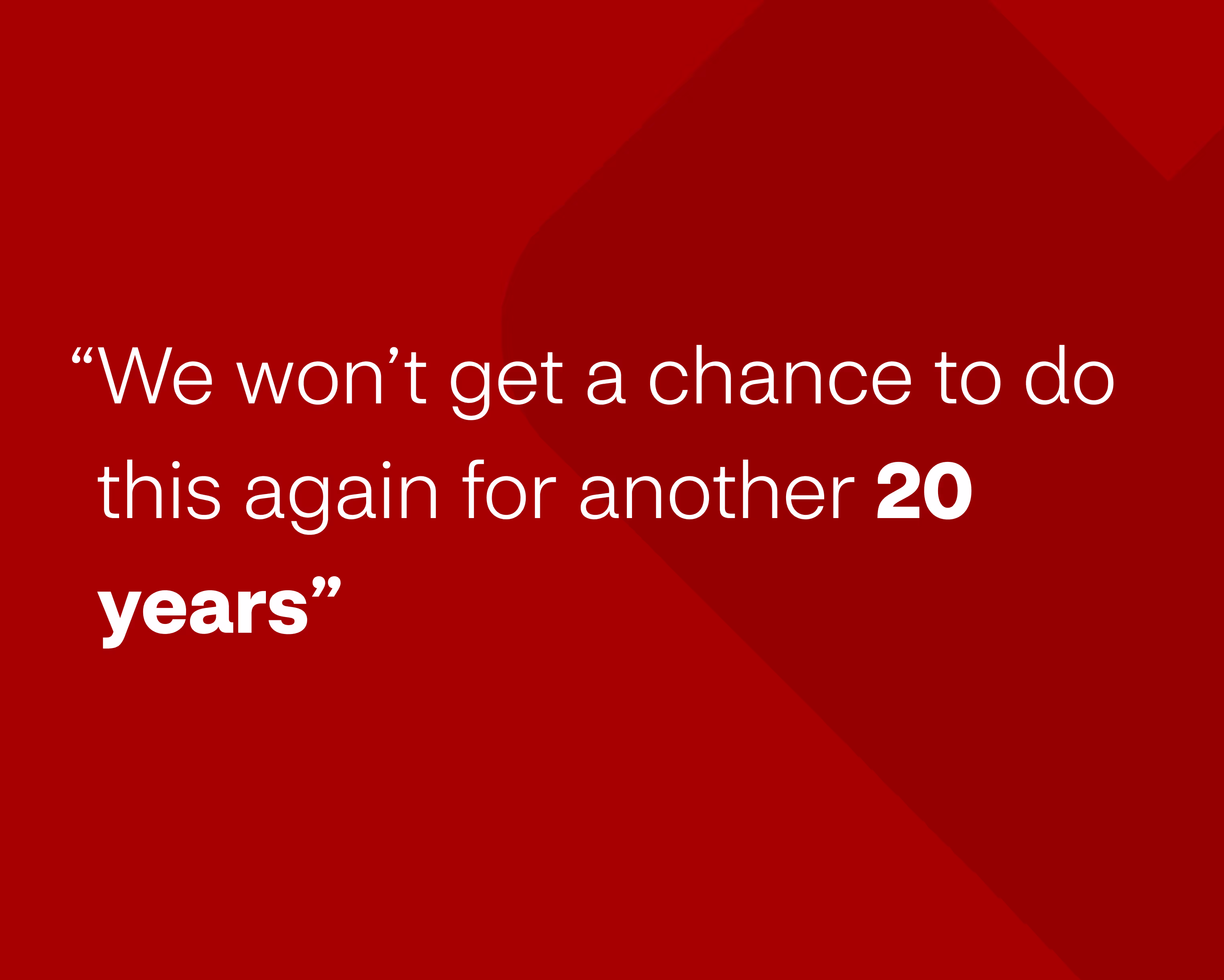
“This is moving the profession into a different world from now.”
During the course of this 10 month project we identified over 200 opportunities. We completely redesign the existing product model from the ground up, creating a modernised, fully integrated, and seamless product experience. We pushed the existing CVS Health design system to its limits and built an entirely new system to push the pharmacy experience into the future.
All of this culminated into 6 hero journeys featuring 100s of new screens and flows, 32 innovative new features, 12 videos reimagining daily stories from within the pharmacy, and developed 16 React prototypes to demo new workflows and features. Besides that, we:

Having spent almost a year exploring what this new future might look like we were ready to begin bringing it to life. A two year roadmap was planned, digging into every detail of the existing systems. We were primed and ready to begin further design iteration and to start stewarding development teams. Disappointingly, after much deliberation. CVS Health then decided to move ahead with the project in-house, where they could utilise their existing resources and reduce their costs.